
MAINSTREET RENEWALReimagining the Lease Application
Overview
Amherst managed 36,000+ residents, leases, homes, and rental communities. Prospective residents are trying to secure a home through a clunky, outdated lease application experience. The goal was to help applicants complete the process on their own while giving them the guidance and confidence they needed.
One application redesign became the foundation for three connected resident experiences.
This project was a complete overhaul, spanning product design and operational toolings. Systems thinking was essential to ensure the foundation could support future experiences, including renewals and the resident portal.
I led the end-to-end redesign of the lease application experience used by prospective renters applying for single-family homes
My role
UI/UX Design, Design System, User Test
Team
PM, 2 FE, ENG, QA
Timeline
2023 Q1 – Q4
Impact Overview
-
Approval time
Fell from roughly 6 days to about 1 day once all household members submitted their application. -
Support call volume
Dropped over 40% YoY in May 2024 and over 60% YoY in June 2024. -
ACH Adoption
ACH adoption nearly doubled, from ~40% to ~75% of rent payments, and the resulting drop in failed payments cut the NSF (Non-Sufficient Funds) rate from ~3.5% to ~2.4%. -
Completion time
30% reduction in application time.
THE CORE PROblems$1M annually was spent on customer service calls throughout the resident cycle.
A broken first impression
Prospective applicants navigated an outdated application with little guidance on what came next. The experience was constrained by Yardi’s design limitations, while the brand itself was overdue for a refresh.
Slow approval time feeds dropout
The application lacked built-in ID verification and background checks, forcing leasing agents to manually screen applicants.
Application drop-offs
Applying for a rental home should take minutes. Instead, applicants abandoned the process because it was lengthy and required information they weren't prepared to provide. Every abandoned application represented lost leasing opportunities.
With ~80% of users on mobile, the experience needed to work where people were actually using it — and it didn’t. Prospective residents hit friction that caused drop-off before completion.
One payment platform
Amherst needed to standardize on one payment system. Moving from Yardi and Zego to Stripe created an opportunity to simplify how residents chose between ACH and card payments and autopay. The new experience would scale across applications, renewals, and the resident portal.
Status & TransparencyBefore & After
A Status Board That Replaced a Support Call
Post-submission was where the experience broke down. Applicants couldn’t see what was happening, what was holding things up, or what household members still needed to do. This led to more calls to leasing agents, who could only tell them to wait.
I reduced uncertainty by making every required step visible before applicants reached it.
I turned a fragmented household application into one shared status view, reducing the need for applicants to call an agent for updates.
The redesigned Status Board put everything in one view: who had submitted, who was still invited, and where the application stood. A sidebar kept lease details, property information, and fees visible. Clear, action-focused messaging replaced passive status labels—telling applicants why they were waiting and what to do next
Opportunity: MSR’s application brought together legal requirements, payments, identity verification, and household information in one flow. The challenge was making a complex process feel simple, clear, and manageable for applicants.
One application redesign became the foundation for three connected resident experiences.
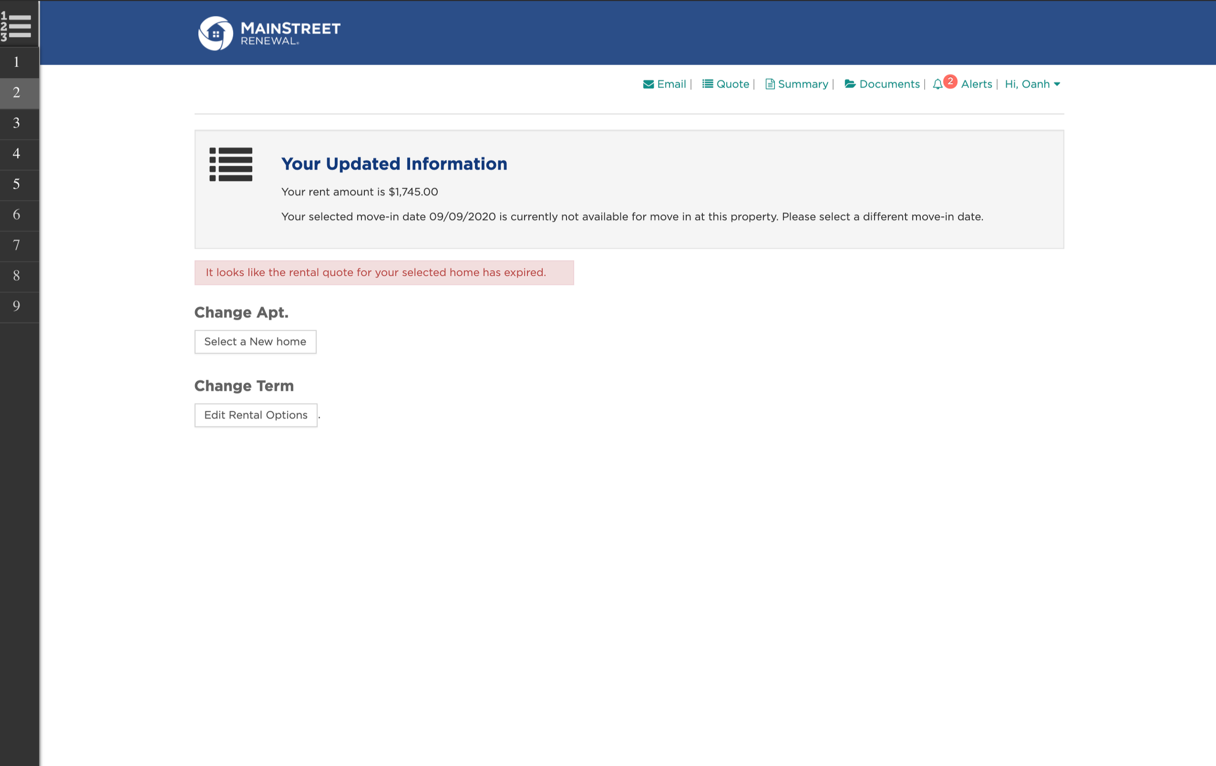
Before
Landing Page - No visible progress or status between steps
Payment
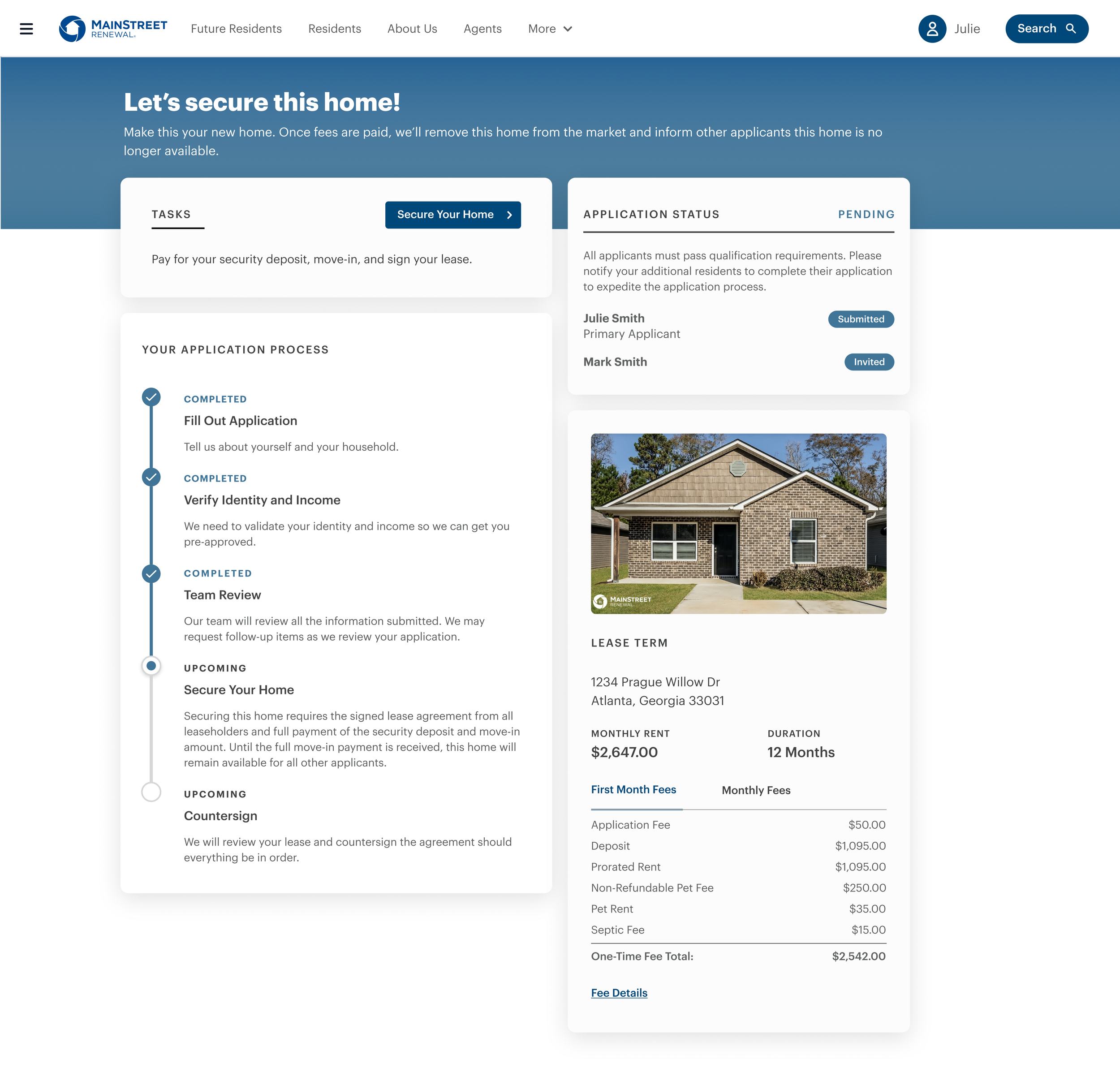
After
Persistent sidebar stepper with completion states
Status board shows each party's application state
Itemized fee breakdown before payment is required
Estimated move-in cost visible from Lease Term step
Co-applicant invite flow made explicit
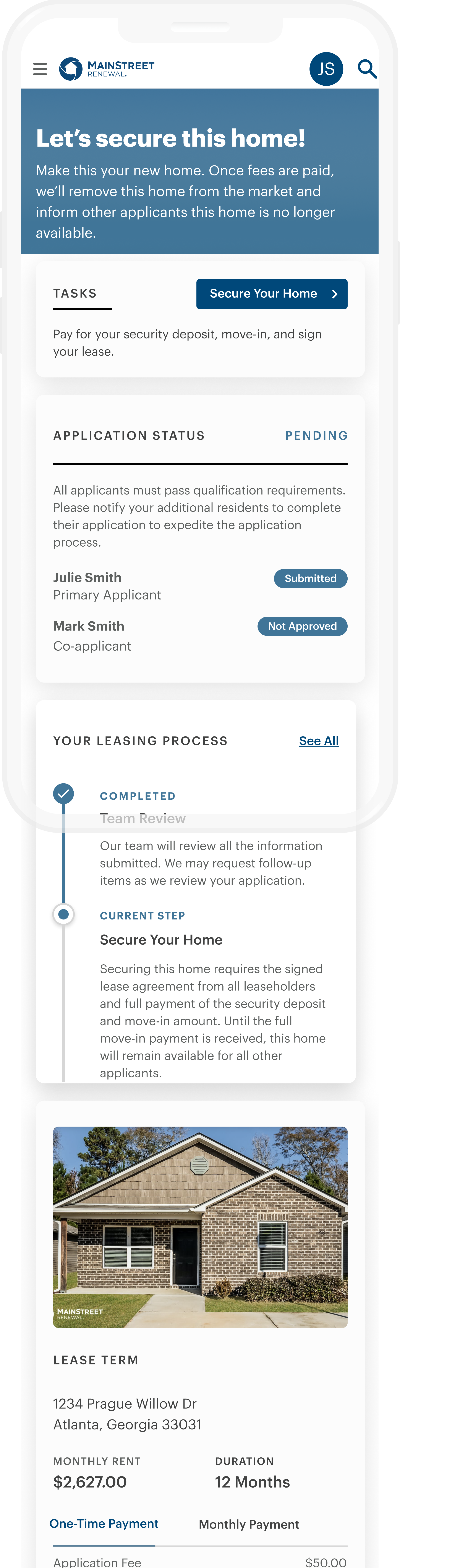
Fully responsive — same logic, optimized for mobile
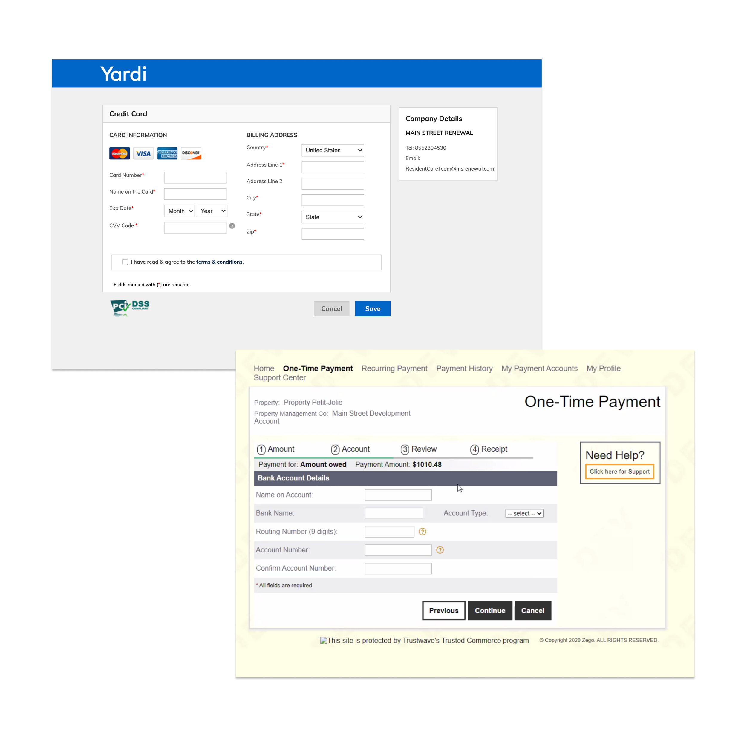
Before
Yardi and Zego used for Application and Rental payments
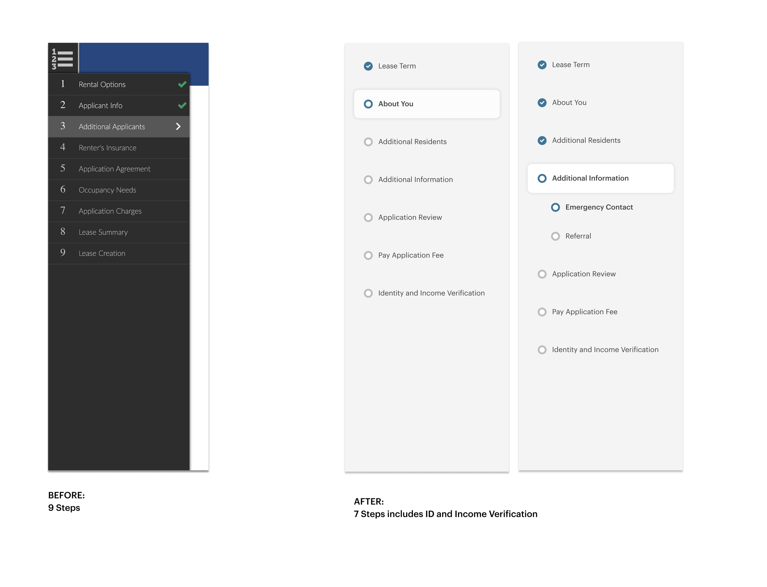
Simplified navigation and reduced perceived steps by restructuring complex requirements like identity and income verification. Added Emergency Contact and Referral fields while making the application fee visible upfront, setting clear expectations before submission.
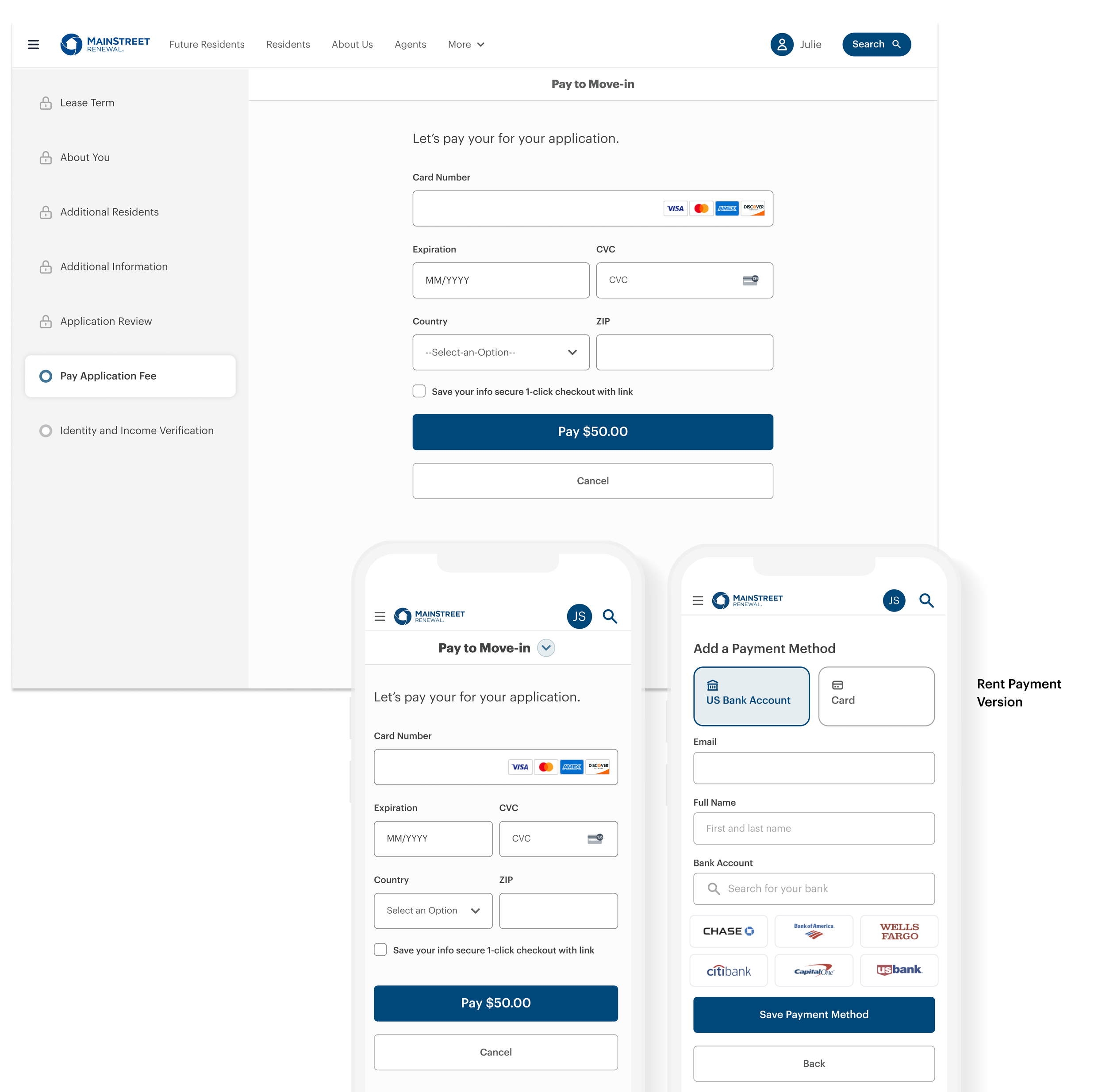
After
Stripe payment
Navigation
ResearchHow I tackle the problem
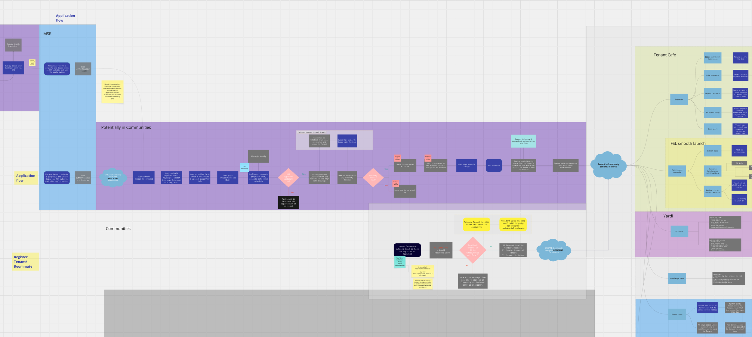
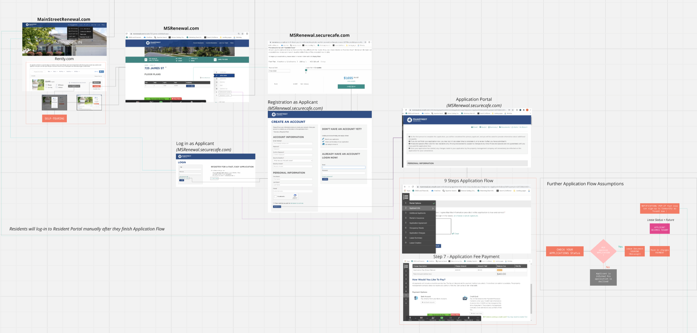
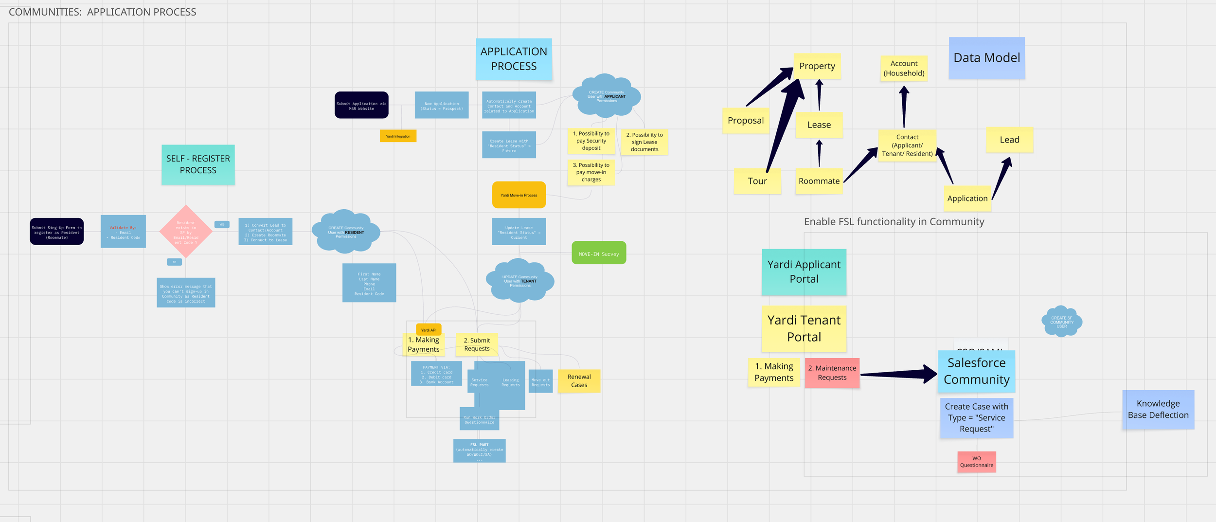
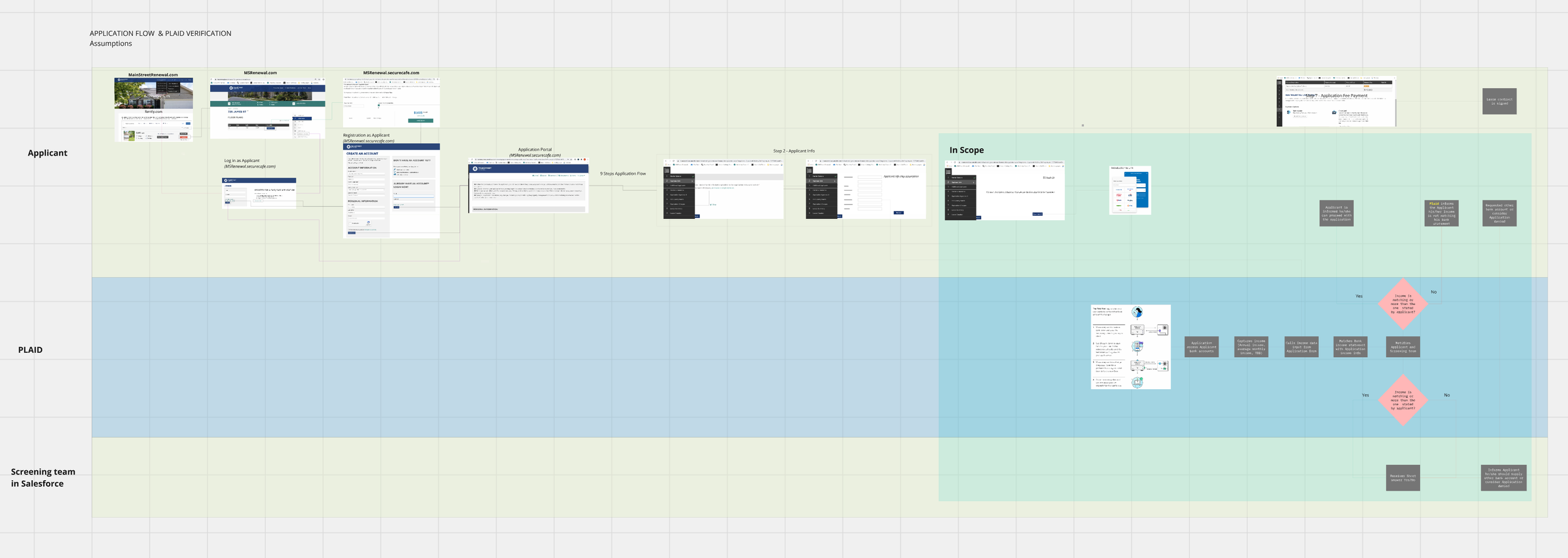
Step 1 - Mapping out the current application flow.
The first thing our PM and I did was to ask everyone to join us in evaluating the current application. This exercise helped us internally gauge how effective our application process is and kick off discussions on potential improvements.
What did the business need the redesigned experience to accomplish?
Applicant pain → operational pain → business problem → design opportunity → redesign → measurable outcome
Interested in our research process? Tap to read
-
I initiated the process by setting up a Miro board to map out the user journey and flows. I invited input from leasing team members to ensure a wide range of perspectives. This collaborative approach helped us identify critical focus areas and integrate diverse insights, aligning our team from the start.
-
In collaboration with the Product Manager, we carefully crafted the research questions and developed interview scripts. This thorough preparation ensured that we could effectively gather deep insights during our interactions with users.
-
We engaged directly with our stakeholders and leasing team to map out their user journeys and identify their primary challenges. This collaborative research was instrumental in providing us with a detailed understanding of user issues, guiding our subsequent steps.
Step 2 - Analyzing quantitative data
After mapping out the end-to-end experience, our PM did a data analysis to find out user behavior and where people drop.
Step 3 – Interviewing user testers
After identifying where drop-offs occur, we began conducting interviews with both prospects and current users to understand why they were leaving during the application flow.
Where did applicants get stuck?
What information did they struggle to understand?
What caused applicants to abandon or delay their application?
What work did the old experience create for leasing teams?
Through these steps, we identified 3 major frictions that block users from applying.
Can you guess what those frictions were? 👇
Design SprintAfter conducting the research, over a week, we explored the problem in-depth, brainstormed multiple solutions, and focused on three key questions:
How Might We
→ Minimize the time for applicants to complete the application?
→ Create a hands-off scoring functionality so that L10n managers can set and forget?
→ Application flow affected how quickly qualified resident moved through to a lease.
Design ideas we came up with from the workshop
From the workshop, we identified several solutions to improve the user experience:
Allow users to preview translation results to motivate them during the signup process.
Implement a passive onboarding checklist to facilitate users (instead of a checklist modal).
An interactive sign-up process to help users get familiar with the product.
Develop a JTBD-based homepage to allow users to identify supported content types earlier.
Opportunities
-
Reduce cognitive load
-
Increase completion rate
-
Make progress visible
-
Completion time
systems thinkingOne decision changed four things downstream
The payment redesign is the clearest example of impact propagation in this project.
The choice to introduce a pre-qualification step early in the flow — before a tenant submitted a full application — rippled into parts of the product I wasn't initially asked to design.
Stripe Payment Redesign
Pre-filtered view sorted by qualification score
New notification surface
Smart alerts for top-matched applicants
Tenant confidence
Pre-qual badge shown on listing before applying
THE FEEDBACK LOOP
Faster approvals increased tenant response rates — tenants who heard back within a day were far less likely to have already signed elsewhere. That compression of the approval window is what drove the occupancy lift from 89% to 93%. The UX change was the mechanism; occupancy was the outcome.
Metrics that showed impact across the business
-
93%
Stabilized occupancy rate, up from 89% Q4 '24 → Q1 '25
-
1 day
Avg. approval time, down from ~6 days
-
61.9%
Accepted application conversion vs 60% target
-
−40%
Call volume YoY for May 2024; −60% YoY for June 2024
-
75%
ACH adoption, up from ~40% —
-
2.4%
NSF rate, down from ~3.5% — a cost the company previously absorbed
-
636
LEASING VELOCITY
Average applications created per calendar day in the weeks after launch. Record number of leases executed with half the staff. -
~2×
PAYMENT HEALTH
More ACH vs card payments. Seamless UI and informed copy shifted resident behavior in a way that directly reduced company financial exposure.
OUTCOMESMobile wins on invited applicants.
Primary applicants are still a different problem.
Post-launch funnel analysis revealed a gap the design hadn't fully solved. With ~80% of users on mobile, the invited applicant experience — a simpler form focused only on their own information — converted better on mobile than desktop. That was expected.
But the primary applicant flow required household information from other members, and mobile drop-off increased sharply at the step where that information was requested. The form itself hadn't changed. The issue was the UX: asking one person to enter someone else's information is inherently harder on a small screen.
Moving Forward
The next design problem is how to make household applications easier: either let each household member complete their own section (co-application), or collect less information upfront and gather the rest progressively.