
Redesigning Main Street Renewal Application
Redesigned of the resident leasing application — reducing customer service calls, application drop-off, driving ACH adoption, and compressing time-to-lease across a high-volume rental portfolio.
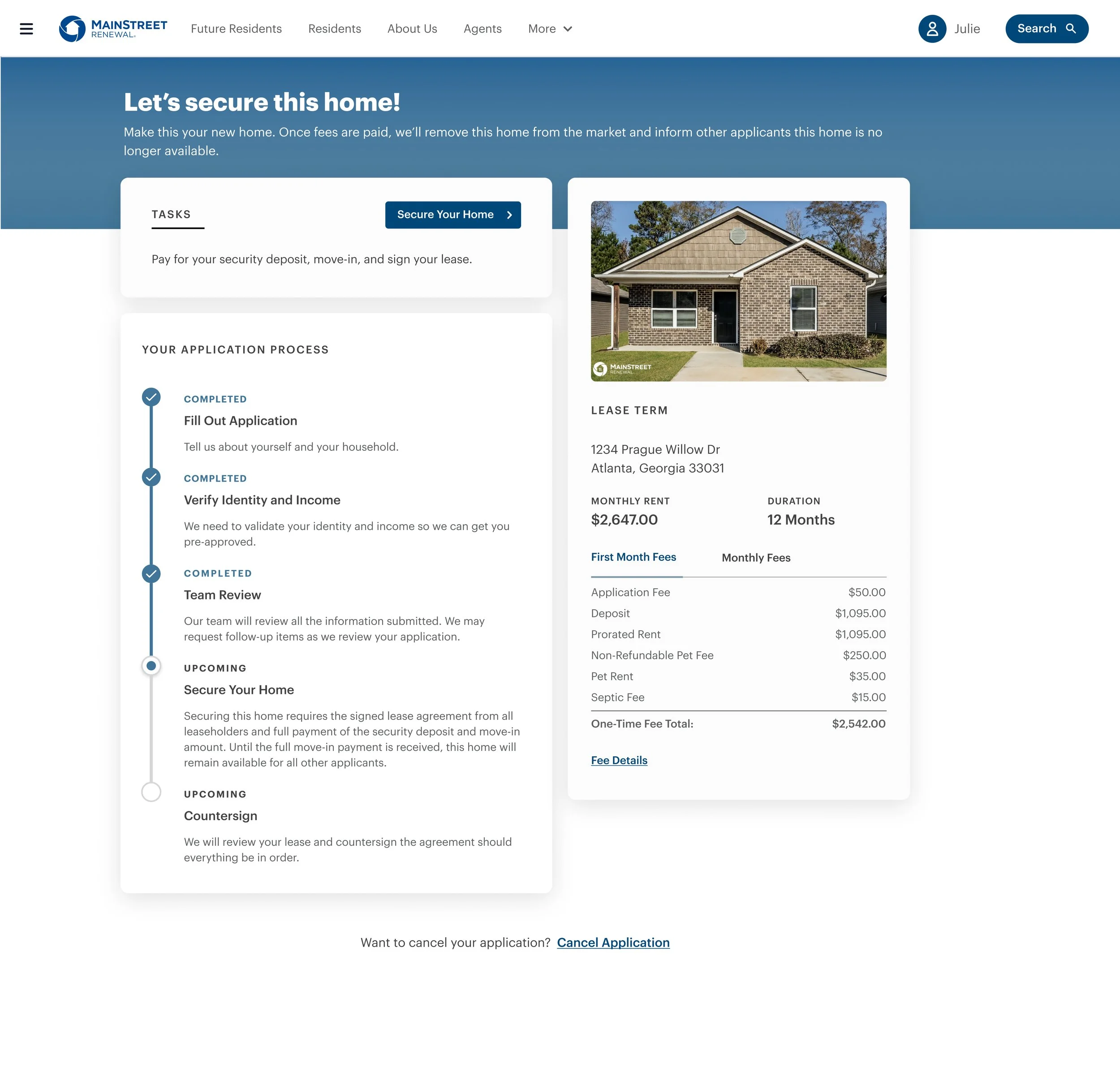
Impact Overview
Why the Redesign?

BEFORE
Fee breakdown only revealed at payment
Too many steps
No visible progress or status between steps
Applicants unsure what documents were required
No clear path after submission
Co-applicant flow poorly communicated
Mobile experience not considered
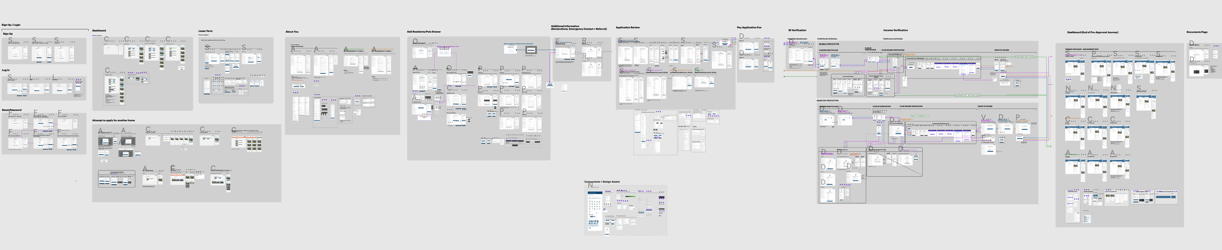
How I tackle the problem
Each decision came from a specific signal — either a friction point in user behavior, a constraint from engineering, or a business outcome the product team was accountable for.
No visible progress or status between steps
Fee breakdown only revealed at payment
Applicants unsure what documents were required
No clear path after submission
Co-applicant flow poorly communicated
Mobile experience not considered
Key Design Decisions
Five bets that shaped the redesign
Each decision came from a specific signal — either a friction point in user behavior, a constraint from engineering, or a business outcome the product team was accountable for.
Decision 01 · Progress
A visible checklist instead of a hidden step count Rather than a generic progress bar, I introduced a persistent checklist that let applicants see exactly which sections were done, in progress, or remaining. This gave users a sense of agency and reduced early abandonment by making the finish line visible.
Decision 02 · Status
Shared visibility into application state I added an application status view showing whether an application was pending, submitted, or approved — and extended that same visibility to co-applicants, so either party could see where the other stood without calling in.
Decision 03 · Payments
Lead with ACH benefits, not payment options Instead of showing ACH and card side-by-side, the redesign surfaced the ACH cost savings first — framing it as the default smart choice. This shifted resident behavior without removing card as a fallback option.
Decision 04 · Structure
A steppered flow over a long-scroll form Breaking the application into discrete, named steps reduced cognitive load at each stage, turning a single overwhelming form into a sequence of small, completable actions.
Decision 05 · FAQ
Contextual FAQs at high-call sections Added FAQ content directly to sections generating the most service calls — including move-in payments and income verification — so applicants could resolve questions in the moment instead of calling in.
Outcome
Service call volume dropped over 40% YoY in May 2024 and over 60% YoY in June 2024 — directly addressing the $1M annual service-call spend that motivated the project, and validating the application status and FAQ features built specifically to deflect those calls.
Application approval time fell from roughly 6 days to about 1 day once all household members submitted, reflecting the steppered flow and visible-progress checklist that reduced stalled, incomplete applications.
ACH adoption nearly doubled, from ~40% to ~75% of rent payments, and the resulting drop in failed payments cut the NSF rate from ~3.5% to ~2.4% — a direct result of leading with ACH benefits instead of presenting payment methods neutrally.
Broader funnel health moved with it: accepted application conversion hit 61.9% against a 60% target, total completions reached 3,810 against a 3,300 target, and average daily applications rose to 636. Stabilized occupancy also climbed from 89% to 93% between Q4 '24 and Q1 '25 — a metric with other contributing factors, but one the faster, higher-converting application flow plausibly fed.
What’s Next
Funnel data surfaced after launch showed mobile applicants converting as well as desktop through single-applicant steps, but falling behind once the flow required co-applicant or household member information — with ~80% of traffic coming from mobile, this is the highest-leverage gap left in the application experience and the next thing I'd tackle.
Research & Discovery
Methods:
User interviews (5 renters, 2 leasing agents)
Competitor analysis
Support ticket review
Key insights:
Renters often abandoned applications due to unexpected fees or unclear requirements
Applicants wanted a checklist and timeline to know where they stood
Mobile users especially struggled with scanning and uploading documents
Understanding the Problem Space
The foundation of RentFlow began with comprehensive research to understand the true scope and impact of inefficiencies in the home leasing market. We conducted a multi-phase research approach that combined quantitative market analysis with qualitative user insights to build a complete picture of user needs and business opportunities.
Our initial market research revealed striking statistics about the current state of rental applications. Industry data showed that the average rental application process takes 7- 14 days to complete, with 55% of applications abandoned before submission. More concerning was the discovery that 73% of applicants reported feeling frustrated or confused during the application process, while 68% of property managers described their current tools as inadequate for efficient tenant screening.
The financial impact of these inefficiencies became clear through our analysis of property management company data. Each day a property remains vacant costs owners an average of $1,200 in lost revenue, while the manual processing of applications requires an average of 3.2 hours of staff time per application. When multiplied across the thousands of applications processed monthly by larger property management companies, these inefficiencies represent millions of dollars in lost productivity and revenue.
User Research Methodology
To understand the human impact behind these statistics, we designed a comprehensive user research program that engaged both tenants and property managers across multiple touchpoints. Our research methodology included in-depth interviews, usability testing of existing platforms, journey mapping sessions, and observational studies of real application processes.
We conducted 45 individual interviews with recent apartment hunters, ranging from young professionals seeking their first rental to families relocating for work. These interviews revealed consistent patterns of frustration around information transparency, communication delays, and the complexity of application requirements. Participants frequently described feeling "lost in the process" and expressed anxiety about application status and timeline uncertainty.
Equally important were our 20 interviews with property managers, leasing agents, and landlords who provided insight into the operational challenges of current systems. These conversations revealed the significant manual work required to process applications, coordinate showings, and maintain tenant relationships. Property managers described spending hours each day on administrative tasks that could be automated, while struggling with fragmented communication channels that led to missed opportunities and tenant dissatisfaction.
Key Research Findings
Our research uncovered three critical insights that shaped the entire design approach for RentFlow. These findings became the foundation for our design decisions and directly informed the features and functionality we prioritized in the solution.
Finding 1:
Mobile-First Behavior Dominates Property Search
Analysis of user behavior data revealed that 78% of property searches begin on mobile devices, yet most existing platforms provide suboptimal mobile experiences. Users frequently described starting their search on mobile during commutes or breaks, then switching to desktop for applications due to poor mobile form design. This device-switching behavior created friction and often led to application abandonment.
Heat map analysis of existing rental platforms showed that mobile users struggled with small touch targets, complex navigation menus, and forms that required excessive scrolling. Users consistently attempted to use mobile-optimized gestures like pinch-to-zoom on property images and swipe navigation between photos, but most platforms failed to support these intuitive interactions.
The implications of this finding were significant for our design approach. We realized that optimizing for mobile wasn't just about responsive design—it required rethinking the entire information architecture and interaction model to prioritize mobile-first user behaviors while ensuring seamless transitions between devices.
Finding 2:
Application Process Complexity Creates Abandonment
Detailed analysis of existing application flows revealed an average of 47 distinct steps required to complete a rental application, including redundant information entry, unclear document requirements, and confusing navigation between sections. Users frequently abandoned applications when faced with unexpected document requests or unclear progress indicators.
Task analysis sessions showed that users spent an average of 23 minutes simply trying to understand what documents were required before beginning the actual application process. Many participants expressed frustration with platforms that didn't clearly communicate requirements upfront, leading to multiple incomplete attempts and eventual abandonment.
The most significant insight was that application abandonment often occurred not due to qualification issues, but due to user experience friction. Users who successfully completed applications on simpler platforms were often the same users who abandoned applications on more complex platforms, indicating that UX design directly impacted business outcomes.
Finding 3:
Communication Transparency Builds Trust
Throughout our interviews, both tenants and landlords emphasized the importance of clear, timely communication during the leasing process. However, existing platforms provided minimal visibility into application status, review timelines, or next steps. This lack of transparency created anxiety for applicants and additional support burden for property managers.
Analysis of customer support tickets revealed that 65% of inquiries were related to application status updates that could have been automated. Property managers described spending significant time responding to "status check" emails and phone calls that interrupted their workflow and delayed application processing.
Users consistently expressed that they would prefer automated updates over having to initiate contact for status information. They wanted to know when their application was received, when review began, what stage of the process they were in, and realistic timelines for decisions. This insight highlighted an opportunity to reduce support burden while improving user satisfaction through proactive communication design.
Competitive Analysis
To understand the current market landscape and identify opportunities for differentiation, we conducted a comprehensive analysis of existing rental platforms, property management tools, and adjacent industries with similar application processes. This analysis helped us understand both the strengths to build upon and the gaps to address in our solution.
Market Leaders Analysis
Zillow Rental Manager emerged as the market leader in property listing and discovery, with excellent map integration and comprehensive property information. However, their application process remained fragmented, requiring users to leave the platform for actual applications. Their strength in property visualization and search functionality provided a benchmark for our discovery features.
Apartments.com demonstrated strong filtering and search capabilities with robust property databases, but suffered from outdated interface design and poor mobile optimization. Their comprehensive filtering options showed the importance of helping users narrow down options quickly, while their mobile experience highlighted opportunities for improvement.
Avail showed innovation in landlord-tenant communication features with integrated messaging and maintenance request systems. However, their application flow remained complex and their mobile experience was limited. Their communication features provided inspiration for our integrated messaging approach.
Adjacent Industry Insights
Analysis of application processes in adjacent industries revealed successful patterns we could adapt for rental applications. Financial services applications demonstrated effective progressive disclosure techniques and clear progress indicators that we incorporated into our design. E-commerce checkout flows provided insights into reducing form abandonment through smart defaults and error prevention.
Healthcare patient portals showed effective approaches to document management and secure communication that informed our approach to handling sensitive rental application documents. These cross-industry insights helped us identify proven UX patterns that could be adapted for the unique requirements of rental applications.
Design Process
1. User Flow Redesign
Created a simplified end-to-end flow:
Address pre-fill via search or geolocation
Eligibility quiz (pre-screening)
Guided step-by-step form with progress bar
Smart document upload (camera and file support)
Confirmation screen with estimated review time
2. Wireframes & Prototypes
Created mid-fidelity wireframes and an interactive Figma prototype
Used conditional logic to personalize the flow (e.g., co-applicant fields only if needed)
3. Usability Testing
Conducted remote testing with 6 users
Iterated on confusing language, unclear CTAs, and upload friction
Design Strategy Framework
The design process for RentFlow followed a user-centered design methodology that prioritized rapid iteration and continuous validation with real users. Rather than following a traditional waterfall approach, we implemented a lean UX process that allowed us to test assumptions quickly and adjust our approach based on user feedback.
Our design strategy centered around three core principles that emerged from our research findings. First, we committed to mobile-first design that prioritized the 78% of users who begin property searches on mobile devices. This meant designing for the smallest screen first and progressively enhancing for larger screens, rather than adapting desktop designs for mobile use.
Second, we embraced progressive disclosure as a fundamental interaction pattern to address the complexity of rental applications. Instead of overwhelming users with all required information at once, we designed flows that revealed information and requirements gradually, allowing users to build confidence and momentum as they progressed through the application process.
Third, we prioritized transparency and communication at every touchpoint to address the trust and anxiety issues identified in our research. This meant designing clear status indicators, proactive notifications, and accessible communication channels that kept users informed without requiring them to initiate contact for basic information.
Information Architecture Development
Creating an effective information architecture for RentFlow required balancing the complex requirements of rental applications with the simplicity users demanded. We began with card sorting exercises involving 25 participants to understand how users naturally categorized rental-related information and tasks.
The card sorting results revealed that users think about rental processes in terms of chronological phases rather than functional categories. This insight led us to organize the platform around the user journey stages: Discovery, Application, Approval, Move-in, and Tenancy Management. Each phase contains the tools and information relevant to that stage of the relationship, reducing cognitive load and providing clear context for user actions.
Within each phase, we implemented a hierarchical structure that prioritizes the most common tasks while keeping advanced features accessible. For example, the Discovery phase prominently features property search and filtering tools, with saved searches and application history available through secondary navigation. This approach ensures that new users can accomplish their primary goals quickly while power users can access advanced functionality when needed.
The navigation structure reflects this phase-based organization through a combination of persistent navigation elements and contextual menus. The primary navigation clearly indicates which phase the user is currently in, while contextual actions relevant to their current task remain easily accessible. This dual-layer approach provides both orientation and efficiency for users at different stages of the leasing process.
Wireframing and Prototyping Approach
Our wireframing process began with low-fidelity sketches that focused on core user flows without getting distracted by visual design details. We created over 150 initial sketches exploring different approaches to key interactions like property filtering, application form progression, and status communication.
These sketches were rapidly converted into digital wireframes using a mobile-first approach. Each screen was designed first for a 375px mobile viewport, then adapted for tablet and desktop breakpoints. This process ensured that the core functionality worked effectively on mobile devices before adding enhancements for larger screens.
The wireframing phase revealed several critical insights that shaped our final design approach. Initial wireframes for the application flow showed that traditional form design patterns created excessive scrolling on mobile devices. This led us to explore card-based interfaces and modal overlays that better utilized mobile screen space while maintaining clear progress indicators.
Interactive prototyping began early in the design process to test key user flows with real users. We created clickable prototypes using Figma that allowed users to complete core tasks like property search, application submission, and status checking. These prototypes were tested with 15 users in moderated sessions that provided immediate feedback on interaction patterns and information hierarchy.
The prototyping process followed an iterative approach with weekly testing cycles. Each round of testing focused on specific aspects of the user experience: navigation clarity, form completion efficiency, or communication effectiveness. This rapid iteration allowed us to identify and resolve usability issues before they became embedded in the final design.
Final Solution Highlights
📋 Step-by-step Application Flow: Clean layout with autosave and dynamic fields
Smart Document Upload: Accepts multiple formats, includes photo tips for IDs
Progress Tracker: Shows current step and what’s left
Status Notifications: Email + in-app updates at each review milestone
Inline Support: FAQs and live chat integrated at key friction points
Outcome
Step-by-step Application Flow: Clean layout with autosave and dynamic fields
🕐 30% reduction in application time
📉 40% decrease in application abandonment
📞 25% drop in support inquiries
👍 Positive feedback from both renters and leasing agents
Next Steps
A/B test new onboarding copy for further clarity
Add support for international applicants
Explore pre-approval flow for verified renters

Introduce your brand
Take a minute to write an introduction that is short, sweet, and to the point.
Key Research Findings
Our research uncovered three critical insights that shaped the entire design approach for RentFlow. These findings became the foundation for our design decisions and directly informed the features and functionality we prioritized in the solution.
Finding 1: Mobile-First Behavior Dominates Property Search
Analysis of user behavior data revealed that 78% of property searches begin on mobile devices, yet most existing platforms provide suboptimal mobile experiences. Users frequently described starting their search on mobile during commutes or
Concepts presented to Roc Nation
Concept 1
Global Activity Map
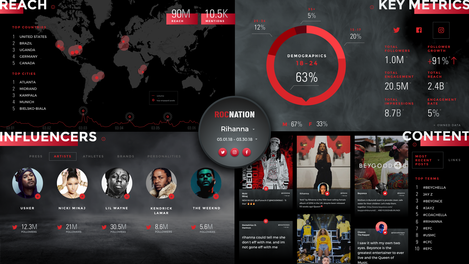
The global activity map is the focal point. The pins grow larger as the number of conversations increase over time. We highlighted these key metrics: Top Cities, Total Engagement, Impressions, Volume Over Time and Top Posts.
Concept 2
Activity Over Time
The timeline is the focal point. As a reporting tool, it is important to see a spike in a conversation over time. My only concern with the timeline is when there is no activity. The purpose is to get an overview picture of what was being said, who said it, when and if it went viral.
Concept 3
Quadrant
The filter is the focal point. Due to the purpose of this piece, Executives, Brand managers and Digital Strategists want to interact with a dashboard easily and quickly. They can’t afford to make a mistake. The filter is intentionally placed in the center for easy access. The modules are equally balanced. An overpowering visual may hinder their storytelling and presentation.
Mid-fidelity Wireframes
Quadrant Concept
It was my recommendation that we narrow it down to the modular 4-quadrant concept. Since the design would be used on an interactive touch-screen tv, it made sense for the filter to be easily accessible. We presented it to the Roc Nation team. We got buy-in from Roc Nation! I kept in mind our user will use this during meetings with artists and executives. It had to be easy to use, visually pleasing and “mistake-proof”. Buttons had to be far apart and easy to find.
High-fidelity Wireframes
Visual Design + Iterations
I pushed the visual design as much as possible all while staying within the perimeters of the brand. At this stage, we were experimenting and refining the filter and data visualizations based on customer feedback.


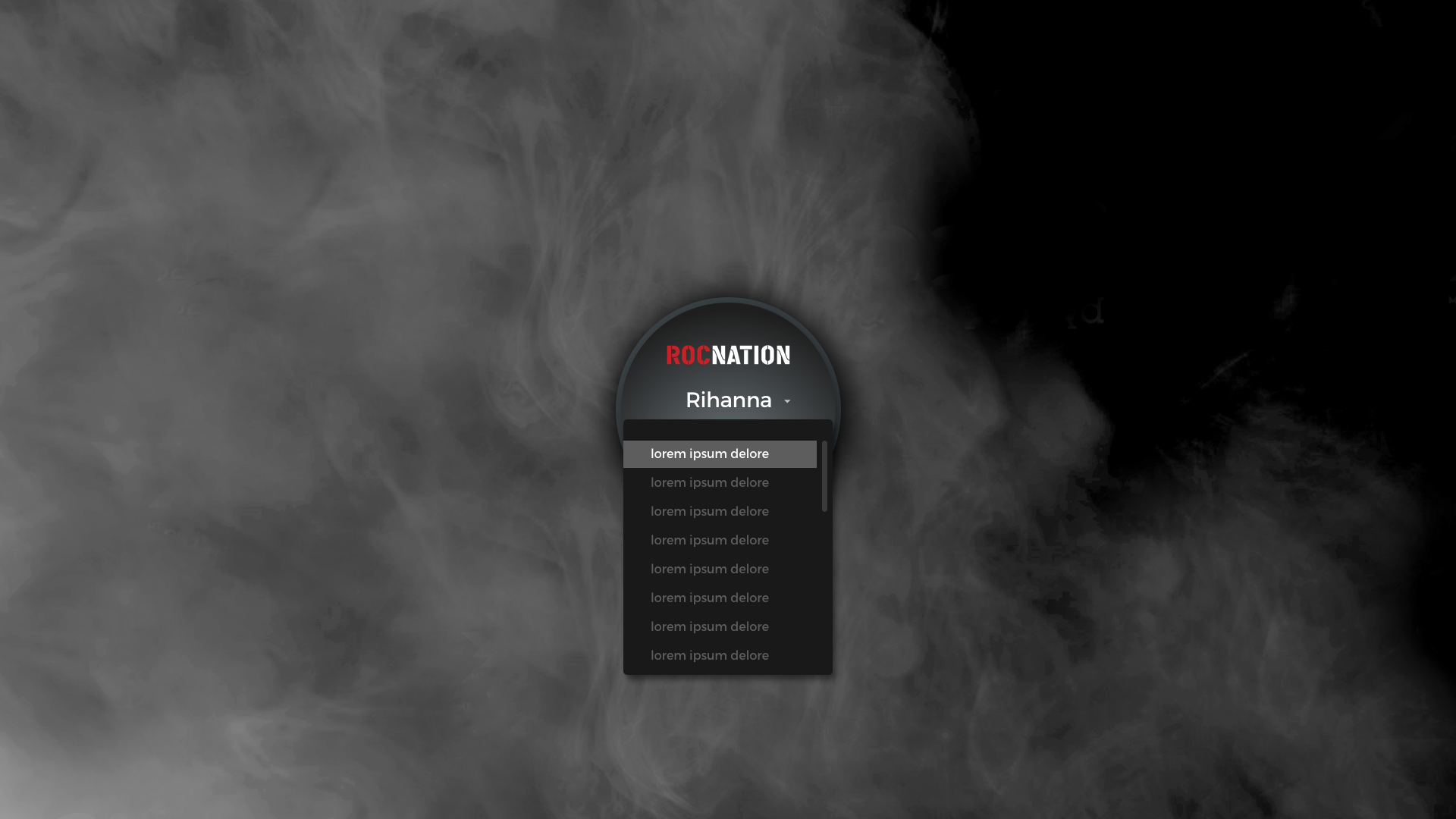


Date Picker
Select Time Range: Quick Select or Custom Date Range
The challenge was from a technical standpoint. I had to collaborate with our developer to see if the Quick Select Date Picker was feasible. To save time while presenting, it made sense to have preselected time periods to filter through.
Development
End Product
Dennis Hadley, developer, took my initial thoughts on how to animate the smoke background. He brought it to a whole new level! Not only did he incorporate a smoke animation in the modal state, but in the Key Metrics and Influencers modules as well. I also worked alongside with Hass, developer, to tweak the typography and spacing. It had to be perfect! Check out the rest of the animation below!
Product 02
Reporting Tool on Desktop

Since Roc Nation was so pleased with the interactive experience, they requested to add a desktop version for reporting purposes. Due to budget and timeline, I went straight to design. The interactive piece was responsive. It was easy to transition to desktop since the modules were stackable, however Roc Nation wanted an export PDF functionality. This was another challenge. Since this was not part of scope, our best solution was to give them an image-based PDF.