

Main Street Renewal · Home Search
Redesigning how renters find, compare, and evaluate homes.
I redesigned Home Search across maps, filters, property cards, listing details, pricing, and touring—making it easier for renters to move from browsing to a confident next step.
The Challenge
The experience made homes harder to evaluate than they needed to be.
Important property details were difficult to scan, costs weren't transparent, promotions and 3D tours were easy to miss, and key actions weren't optimized for mobile. Platform constraints also created inconsistent typography and interaction patterns across the experience.
01 · Map + Property Cards
Finding and comparing homes.
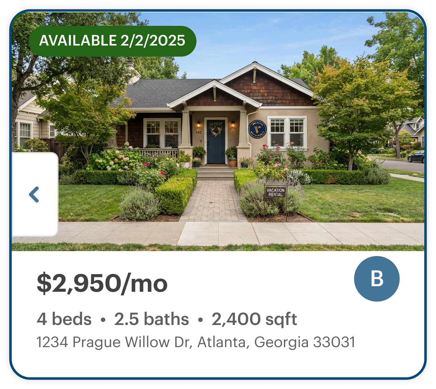
I redesigned the discovery experience so location, price, and property details worked together. The map and cards share a consistent hierarchy, making it easier to compare homes without losing geographic context.
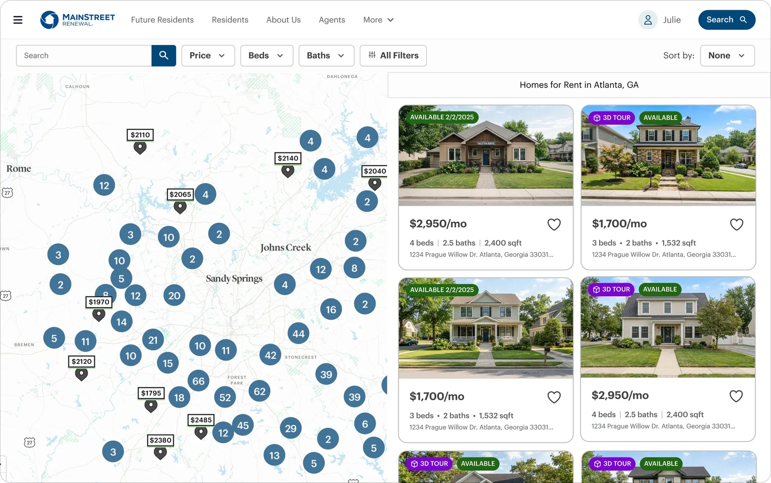
Location stays visible.
Price pins and clusters keep affordability and location visible. Base pins also include hover and selected states that connect each location with its property card.
Comparison becomes predictable.
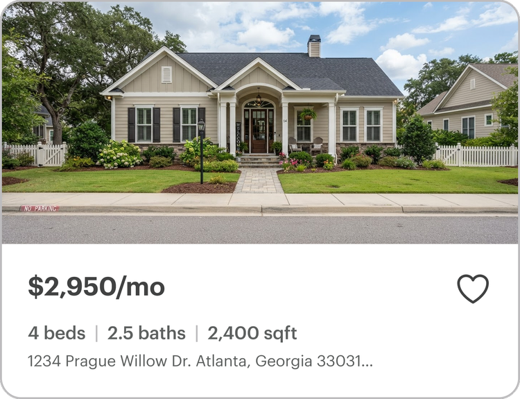
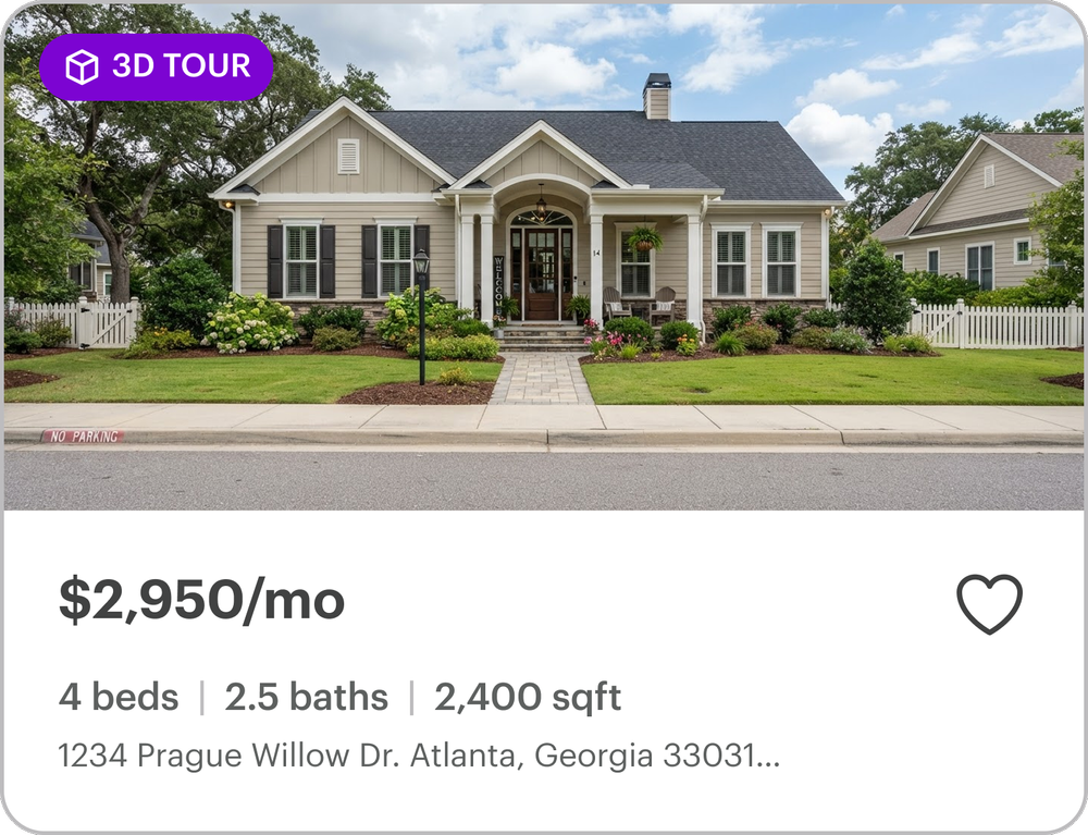
Price, property details, availability, 3D Tour, and Favorite follow a consistent hierarchy across results.
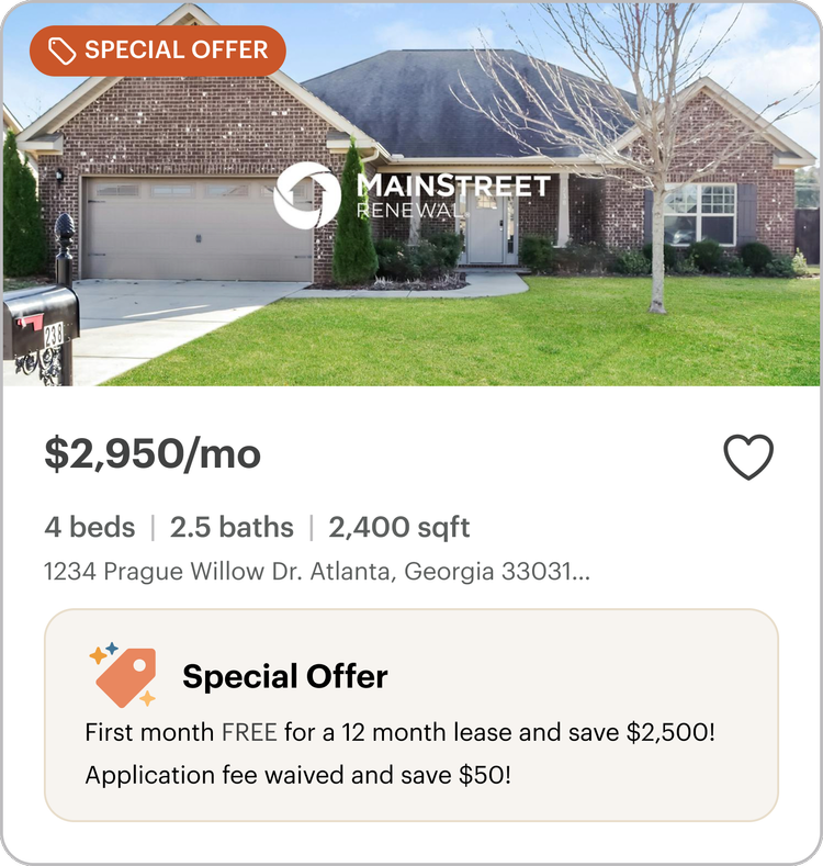
Flexible without feeling different.
Base, 3D Tour, promotion, and nearby states adapt to different content without changing the underlying structure.
02 · Filters
Narrowing the search without adding complexity.
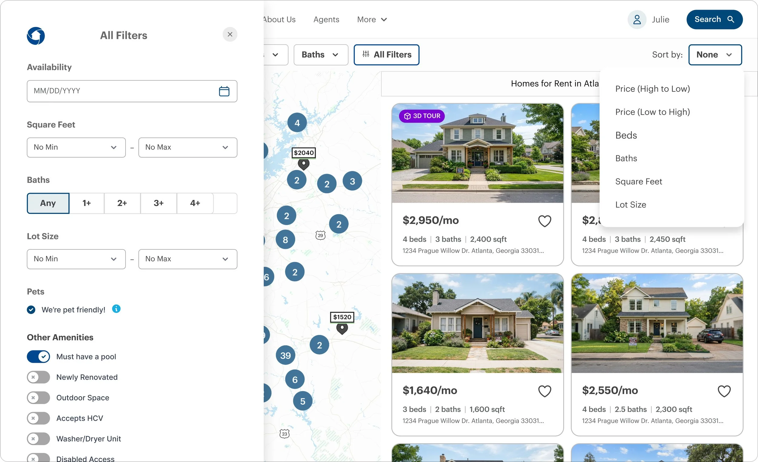
Desktop kept the most common criteria close to the results. Additional filters and sorting stayed accessible without overwhelming the main search experience.

03 · Listing Page
Making a home easier to evaluate.
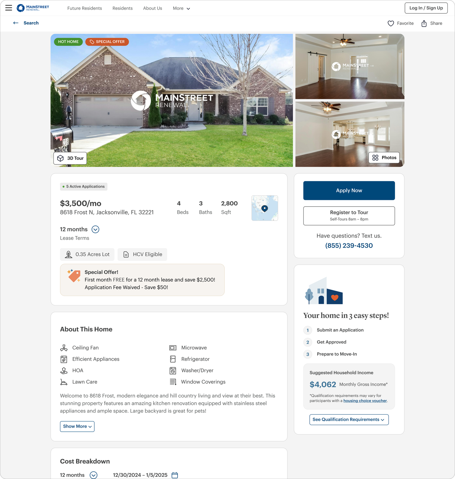
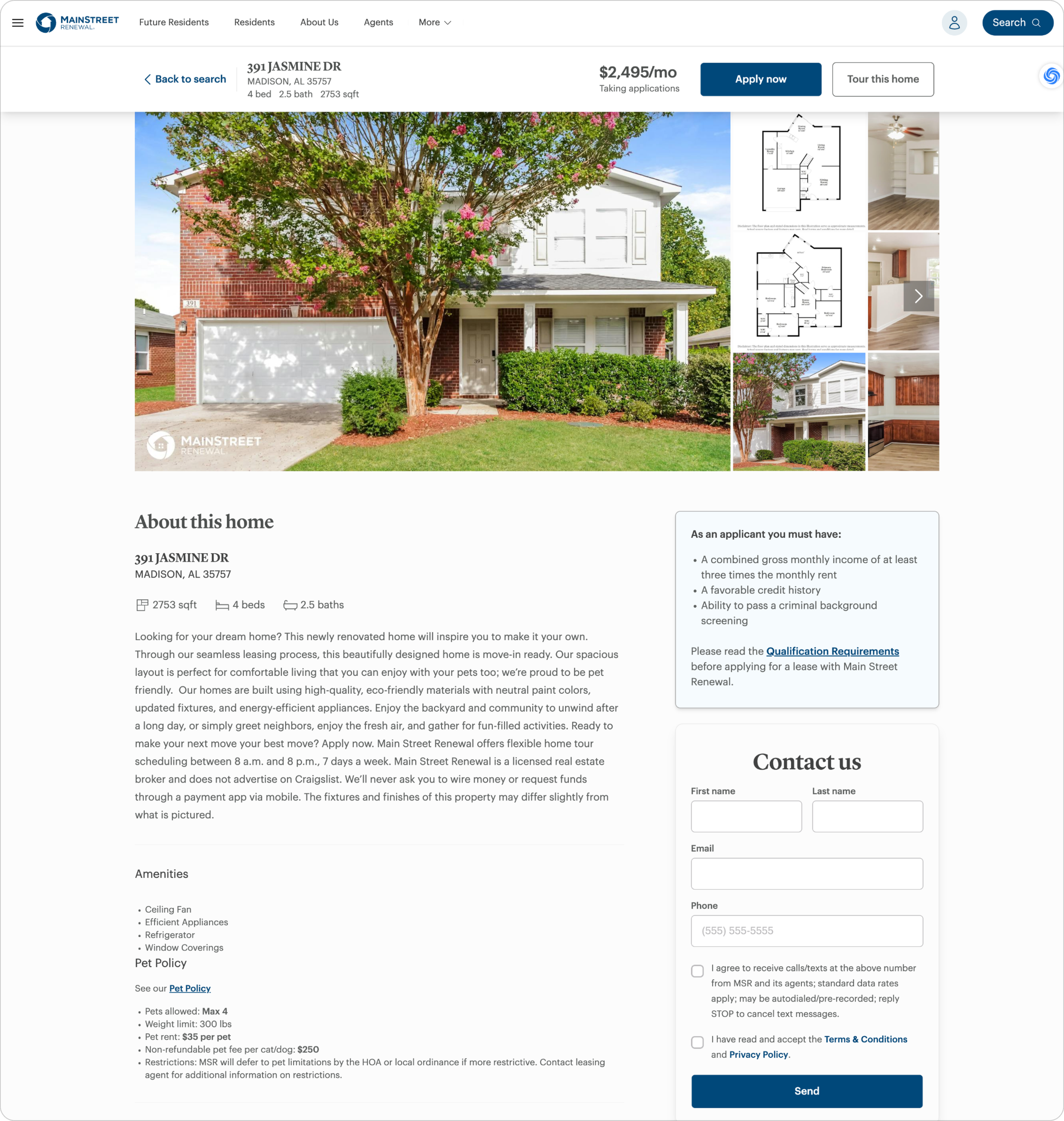
Once renters selected a home, the experience needed to help them answer three things quickly: Is this the right home? What will it actually cost? And what should I do next? I reorganized the listing around those decisions, making property details easier to scan, pricing more transparent, and nearby alternatives easier to understand.
Before & After · Listing Page
Reorganizing the page around renter decisions.
Scannable home details
Moved essential property information out of dense body copy and into a clearer hierarchy.
Transparent pricing
Added recurring and one-time costs so renters could understand more than the advertised rent.
Clearer next steps
Made special offers, 3D Tour, Tour, and Apply easier to recognize and act on.
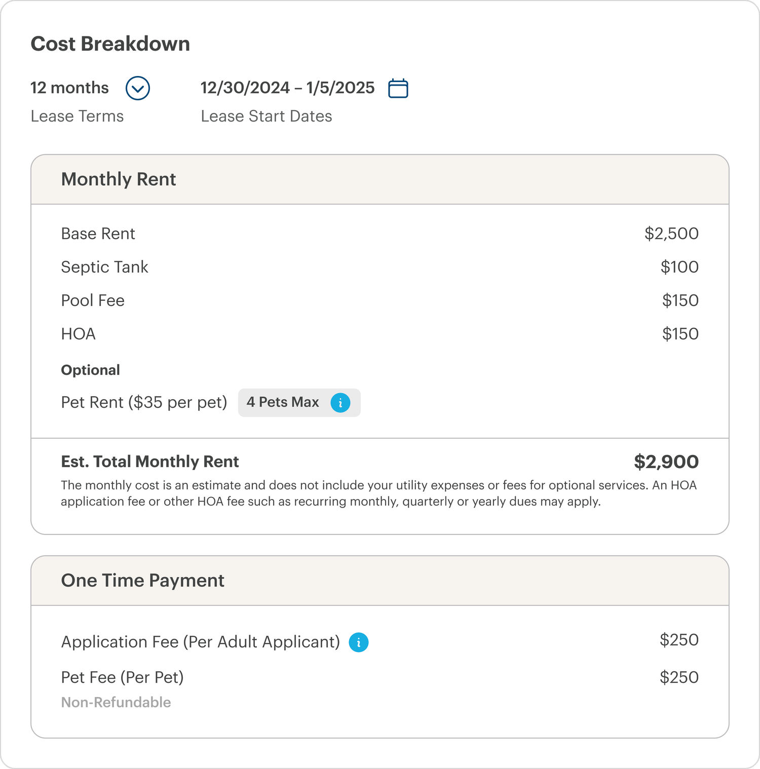
Cost Transparency
Showing the real cost before application.
Base rent alone didn't give renters a complete picture of affordability. The redesigned listing brings recurring fees, one-time costs, and the estimated monthly total into the decision earlier—before someone commits to applying for the home.
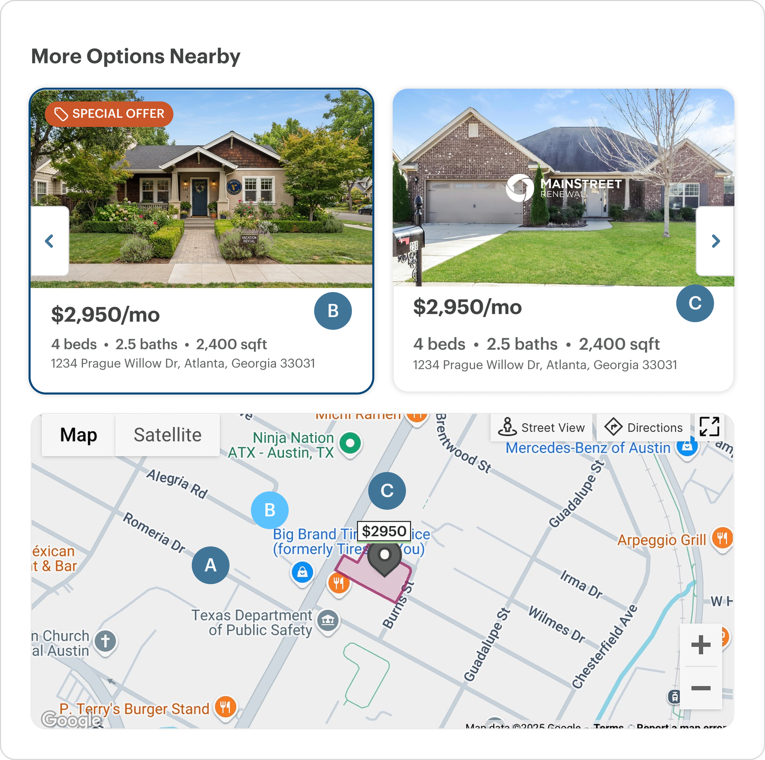
More Options Nearby
Keeping the search moving when a home isn't the right fit.
A listing shouldn't become a dead end. I paired nearby homes with map context so renters could compare alternatives and understand exactly where each option was located without restarting their search.
Final Direction
A more connected path from search to action.
The redesign connected search, property evaluation, pricing, touring, and application into a more consistent renter experience. The work was in development at the end of my time at Amherst.