

Reimagining the Lease Application
Turning a costly, fragmented application into a guided resident experience — while creating a foundation that could scale beyond the application itself.
Led product strategy and end-to-end experience design from problem definition through launch.
Research & insights
UX/UI design
Prototyping
Systems & patterns
Engineering
QA
Leasing operations
Business stakeholders
ID & Income verification
Household management
Payment
Application status
Renewal
Resident portal
lease conversions
support calls
application approval
up from ~40%
One resident journey, redesigned from application to approval.
The redesign connected application, verification, status, and payment into a clearer experience for prospective residents.
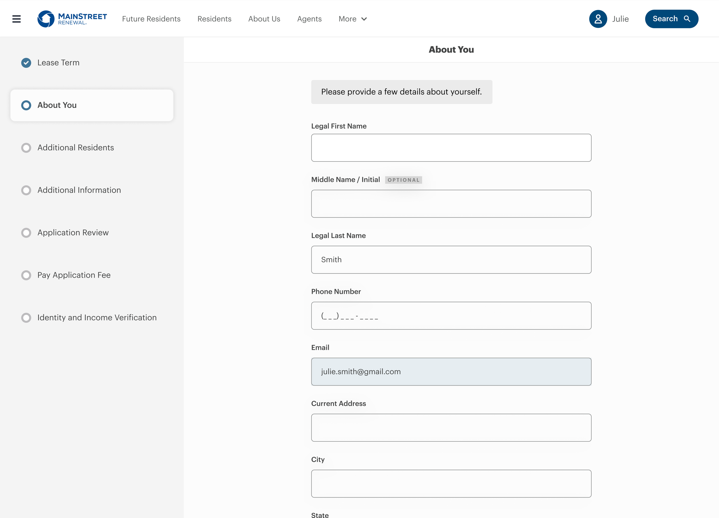
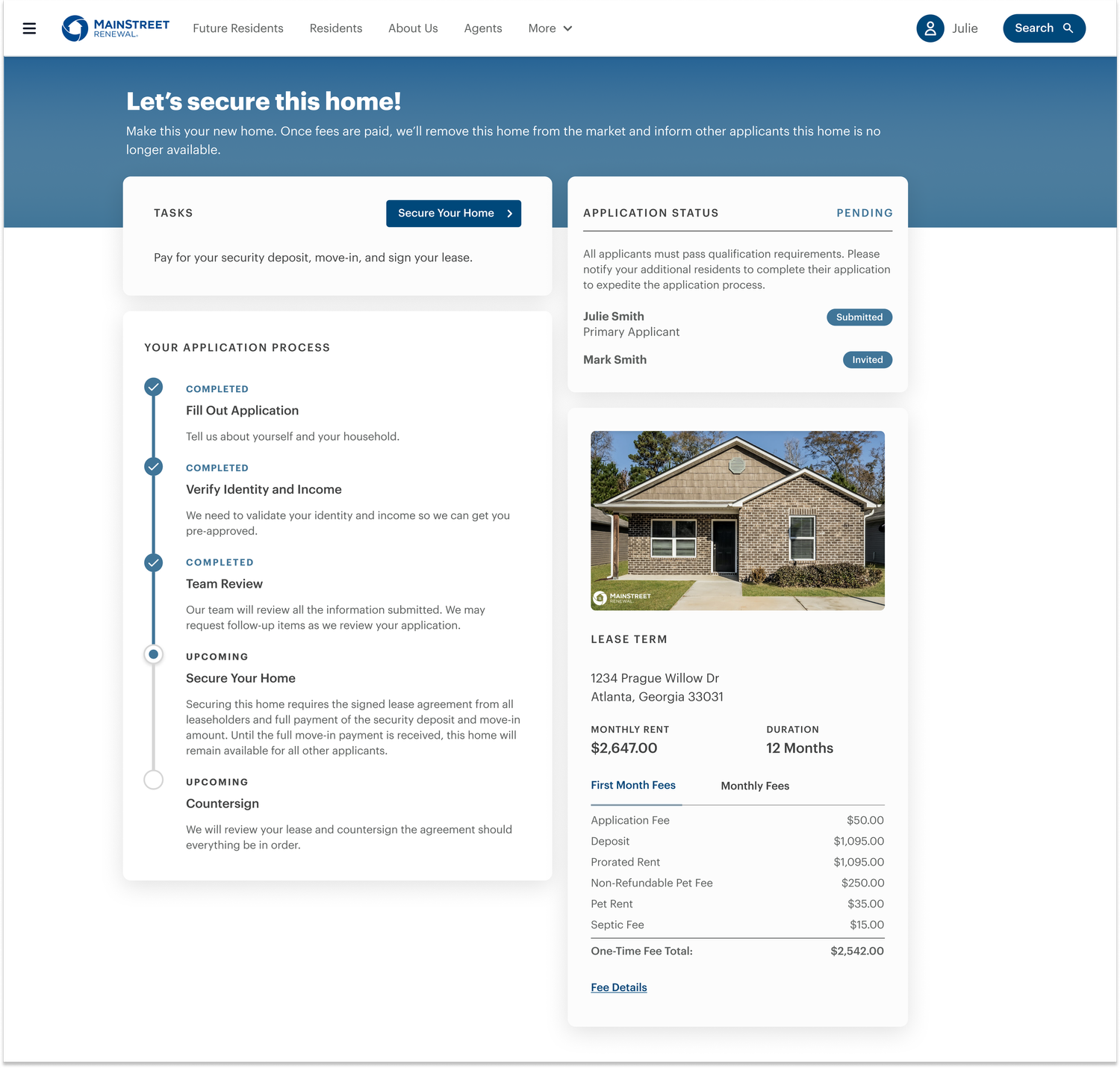
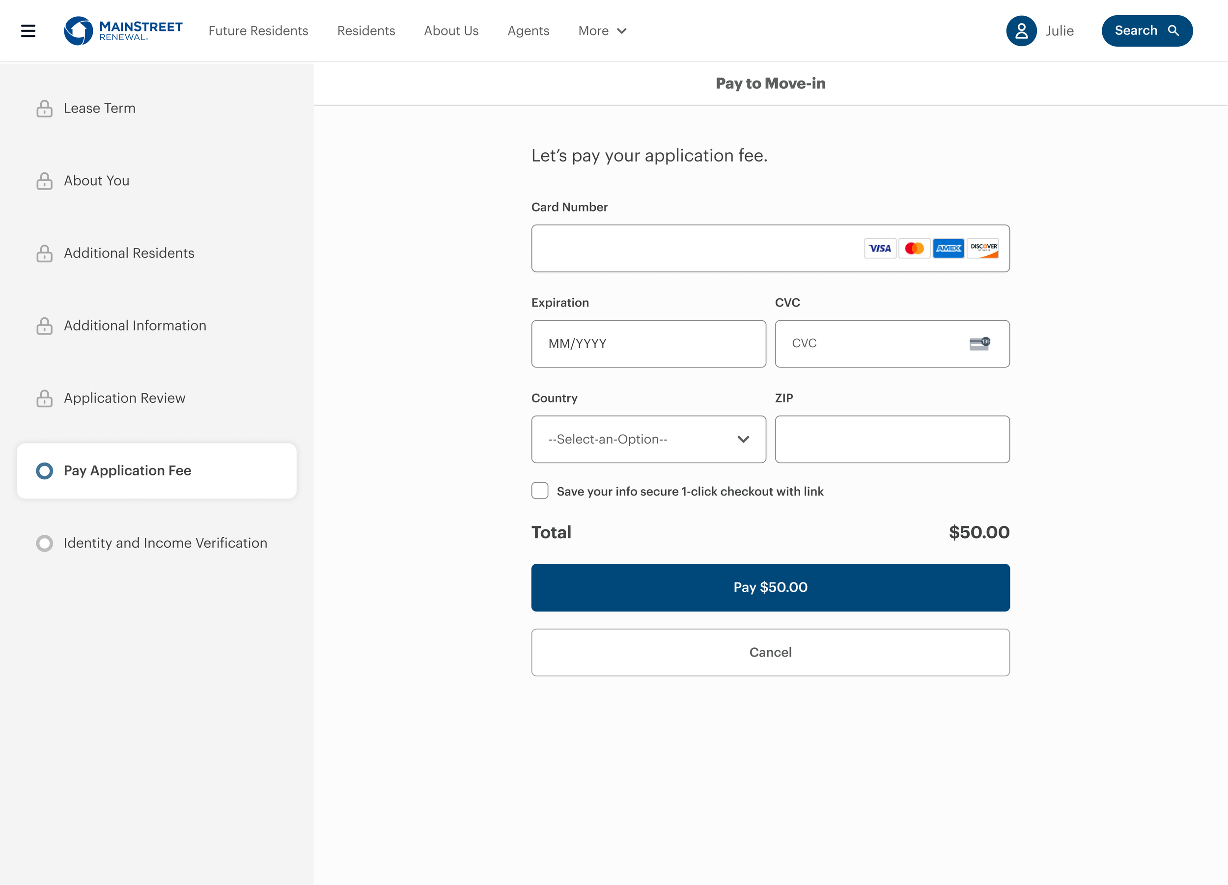
A clearer application with stronger navigation and integrated verification.
Applicants could see progress, household status, and what needed to happen next.
A reusable payment experience designed to extend beyond the application.
The application was only one part of a much larger problem.
Main Street Renewal manages thousands of single-family rental homes across the U.S. The application was often the first meaningful interaction a prospective resident had with the company—and the experience was falling short.
Applicants navigated a lengthy, outdated application with little guidance about what came next. Manual verification and operational processes created additional work for leasing teams.
The existing experience was constrained by Yardi.
Yardi's design limitations restricted how much we could improve the application within the existing platform. The redesign required us to rethink not only the interface, but the system supporting it.
Across the resident lifecycle, Amherst was spending approximately $1M annually on customer service calls.
The opportunity wasn't simply to make the application look better. We needed to reduce friction for residents while reducing the operational work required to support them.
A broken first impression
Outdated UI and limited guidance made the first interaction feel harder than it needed to be.
Slow approval
Manual identity verification and screening created operational work and slowed the path to approval.
Application drop-off
Lengthy requirements and mobile friction caused applicants to abandon before completion.
One payment platform
Moving to Stripe created an opportunity for a scalable payment experience across the resident lifecycle.
Understanding where the experience was breaking down.
We combined an audit of the existing application with product data and feedback from applicants and leasing teams to understand where people were getting stuck—and where those problems created more operational work.
Mapping the existing experience
Our PM and I mapped the application end-to-end to identify friction, dependencies, and where the experience was creating unnecessary complexity.
Finding where applicants dropped off
Funnel data showed where applicants were abandoning the process. With ~80% of applicants on mobile, mobile friction couldn't be treated as a secondary problem.
Connecting applicant and operational pain
Feedback from applicants and leasing teams helped us understand where confusion was creating support calls, manual work, and delays in the application process.
The problem wasn't simply that the application was too long.
Applicants needed to understand where they were, what they needed to do next, and what other household members were responsible for. Those same gaps were creating additional work for leasing teams.
The application needed more than a redesign.
Yardi's design limitations constrained how far we could improve the experience. Rather than continue working around those limitations, the team moved toward a custom application experience with greater control over the resident journey.
How do we redesign the application?
How do we create a resident experience that removes unnecessary complexity from the entire journey?
Making the application easier to understand and complete.
The redesigned status experience gave applicants more visibility into what was happening, what still needed to be completed, and what to do next.
Applicants were left waiting without enough context.
The original experience provided limited visibility into application status, pending household actions, fees, or what applicants needed to do next.
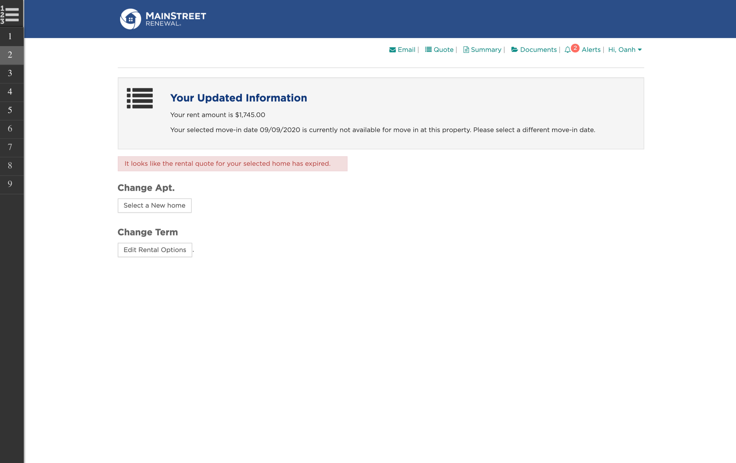
One place to understand progress, responsibilities, and next steps.
Clear next steps
Surfaced required actions and important updates in one place, so applicants always knew what to do next.
Clear progress
Reorganized the experience around understandable stages so applicants could see where they were in the process.
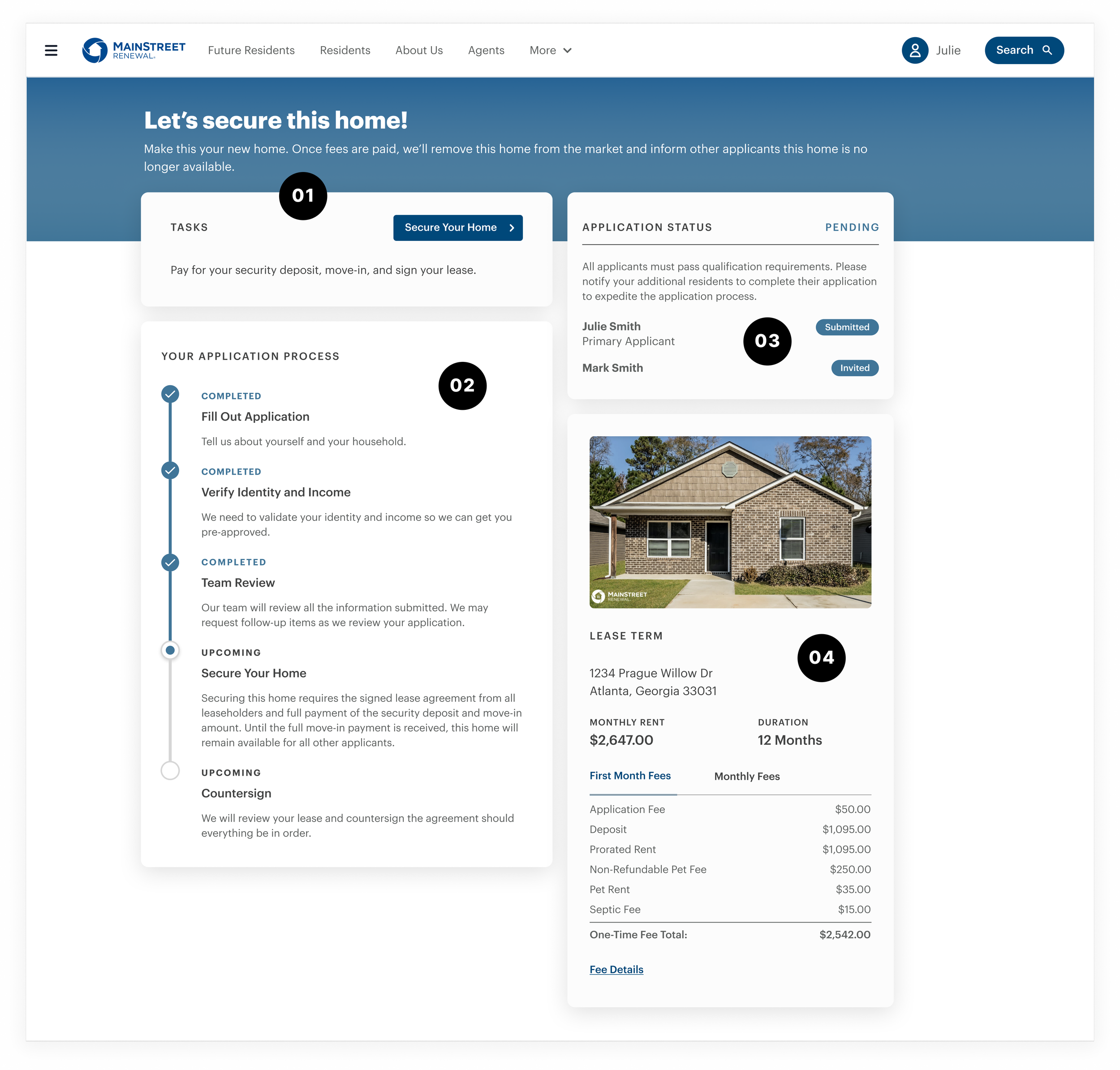
Application status
Made pending steps and household progress visible instead of leaving applicants waiting without context.
Fee transparency
Surfaced payment requirements earlier so applicants could understand costs before reaching checkout.
From manual review to a guided application.
The redesign didn't just simplify the interface. It brought identity and income verification into the application, reducing manual work while creating a clearer path for applicants.
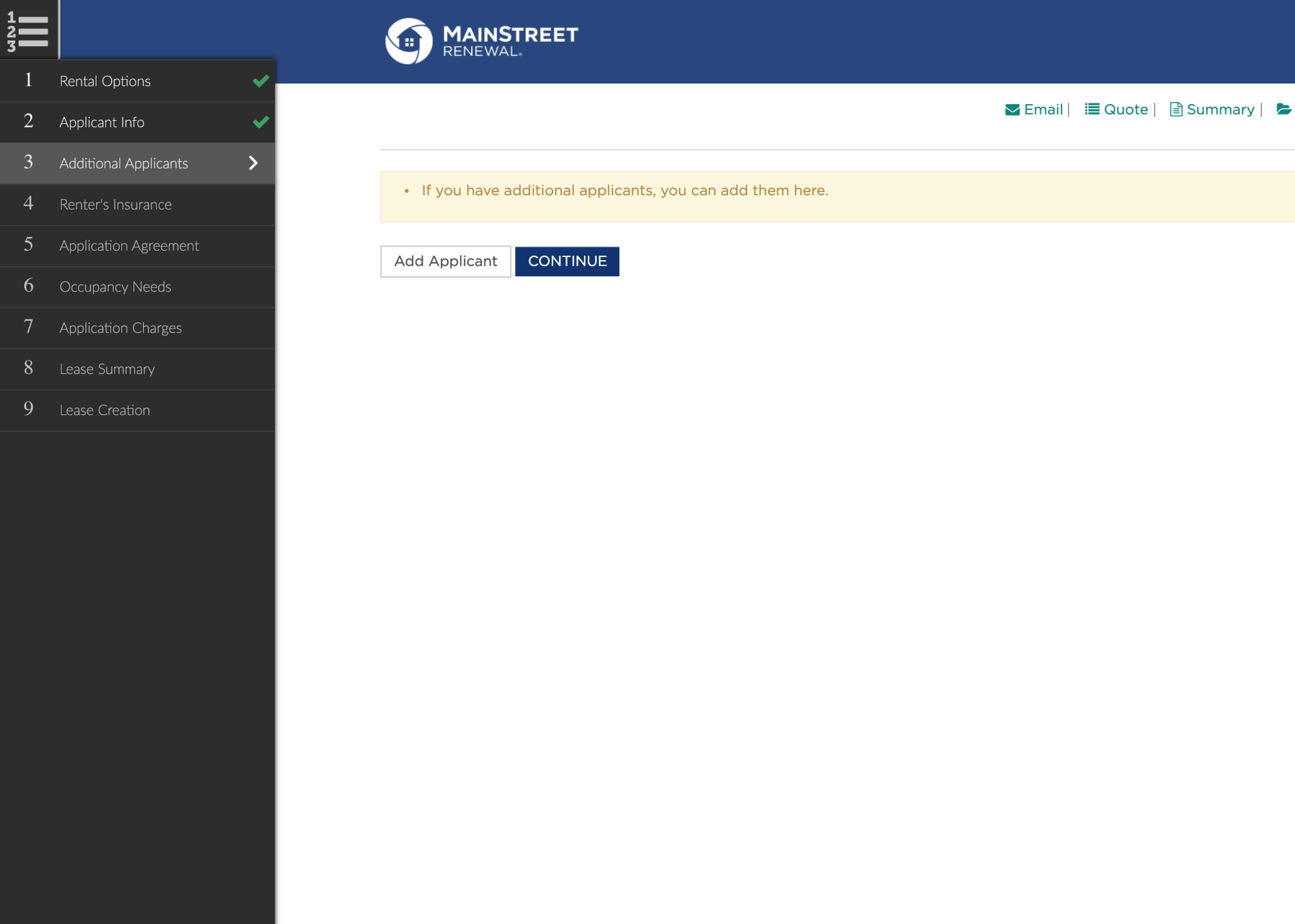
Verification happened outside the application.
Identity and income information required manual review by leasing teams, adding operational work and slowing the path to approval. Applicants also had limited guidance on what happened next.
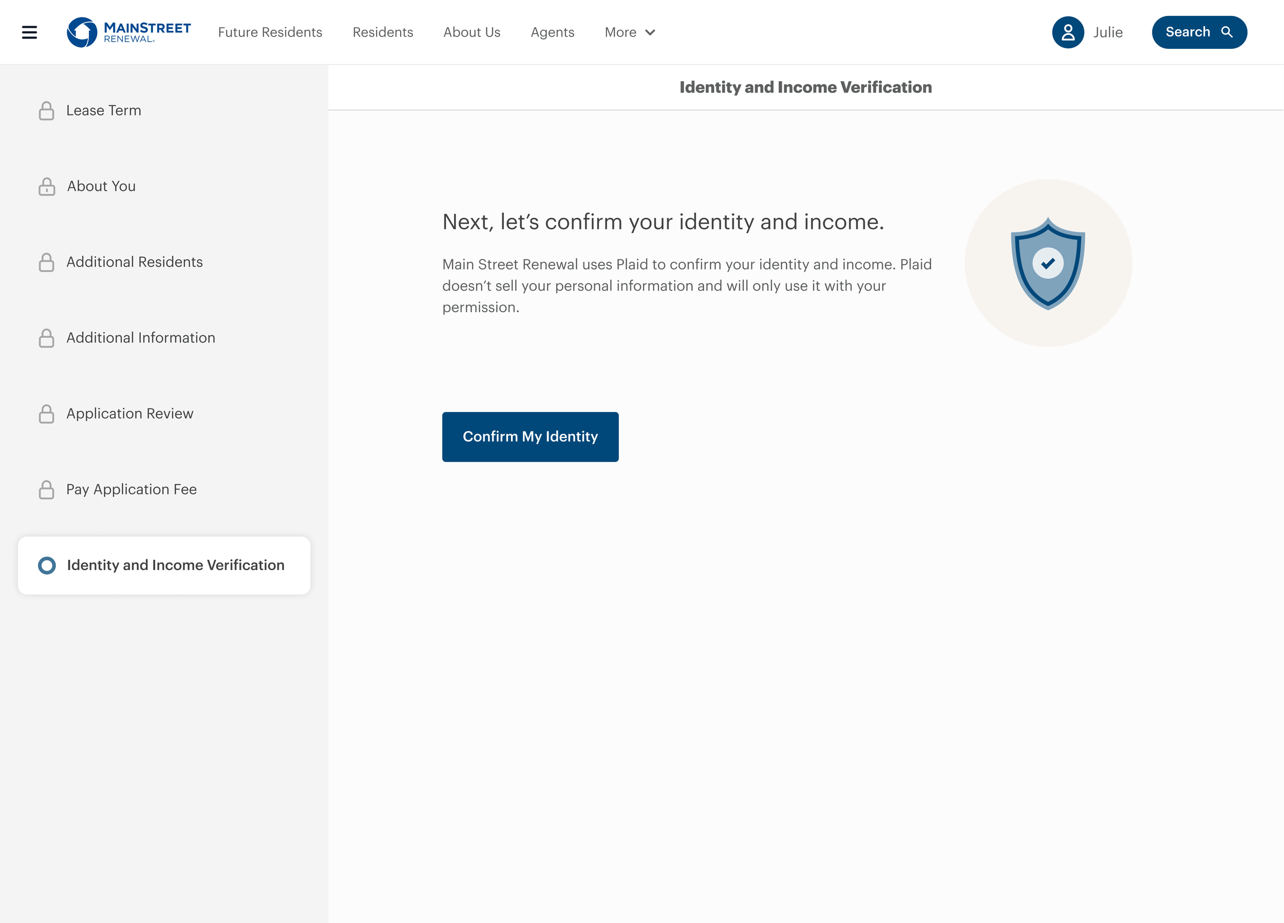
Verification became part of the application.
Identity and income verification were integrated into the experience and moved later in the flow—reducing manual work while letting applicants build momentum before completing more time-intensive steps.
Put the more demanding steps at the right moment.
Identity and income verification were new steps and could take additional time to complete. Rather than introduce that friction early, we moved verification later in the journey after applicants had already made progress.
One payment experience. Multiple resident journeys.
ACH, card, and autopay patterns were designed to extend across application, renewal, and the resident portal — using the new payment platform, Stripe.
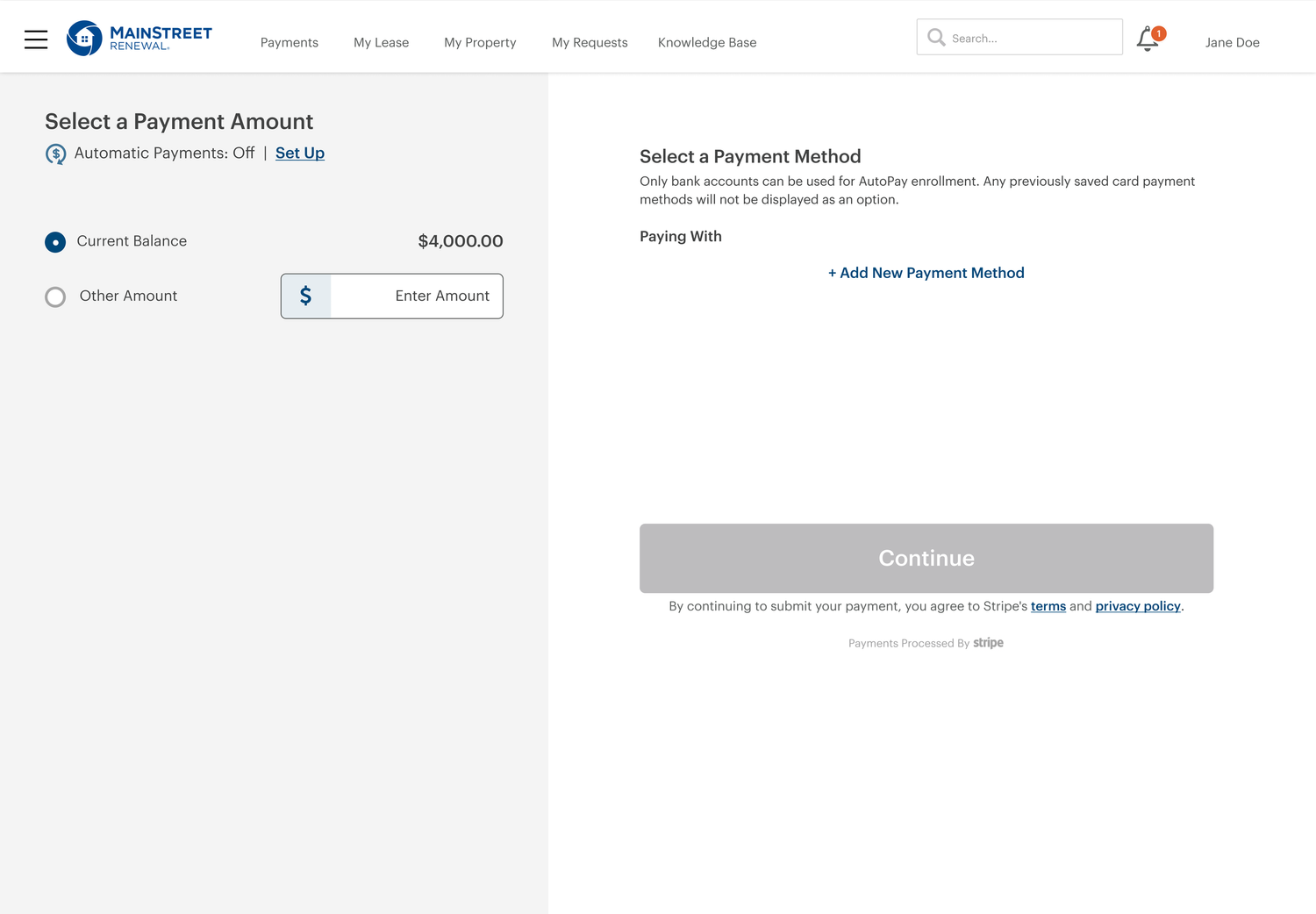
Rent payment selection
Clearer guidance helped residents add payment method and payment amount.
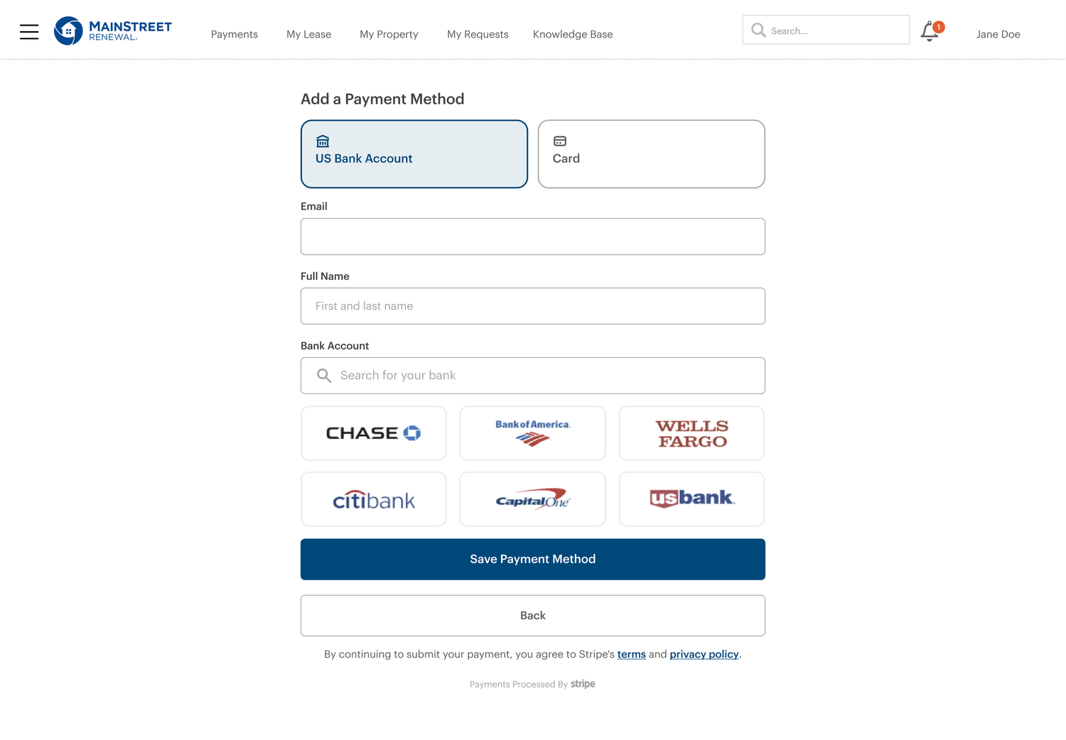
ACH setup
Simplified bank account setup while keeping the payment flow focused.
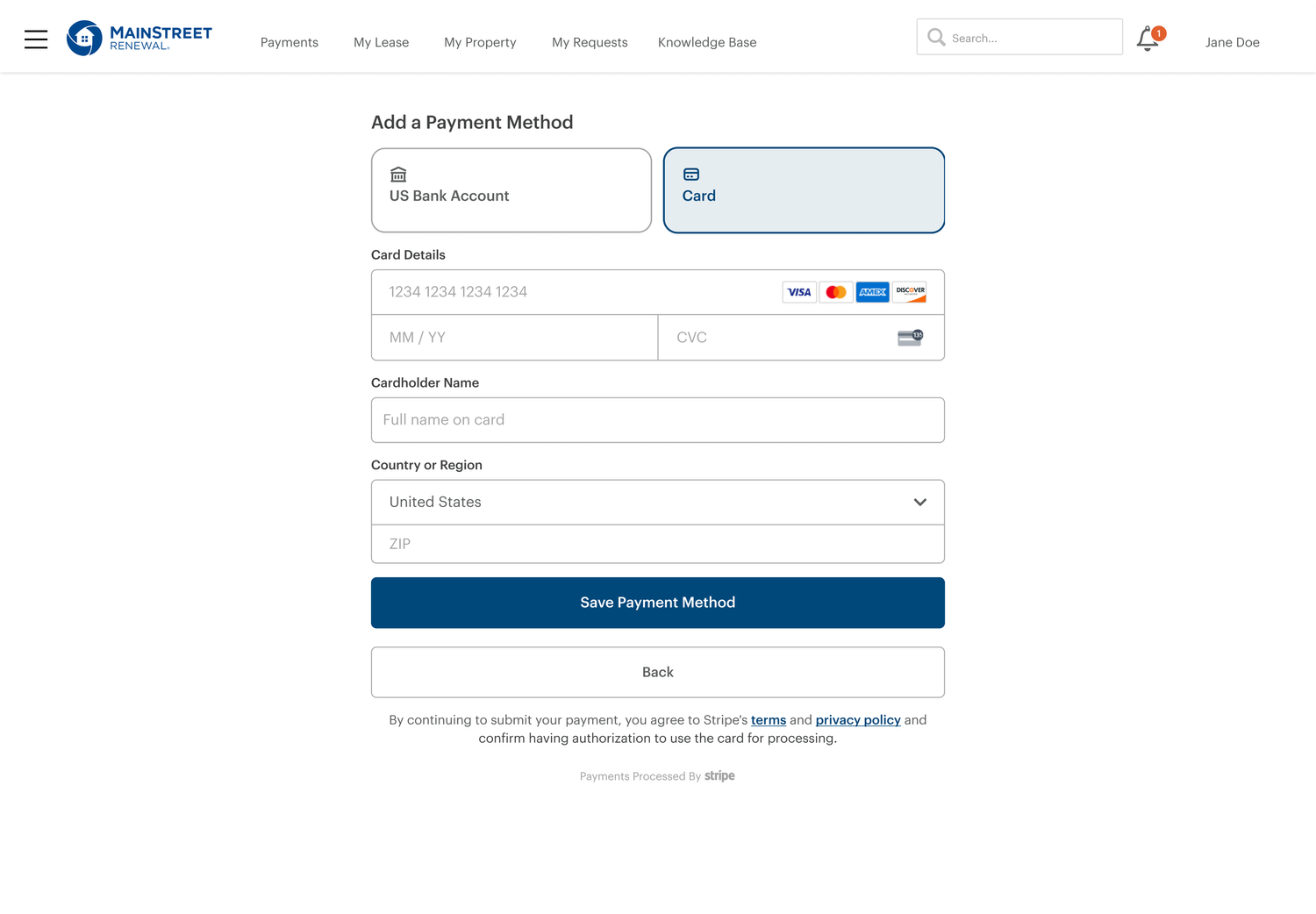
Card payment
A consistent card experience gave residents another clear way to pay.
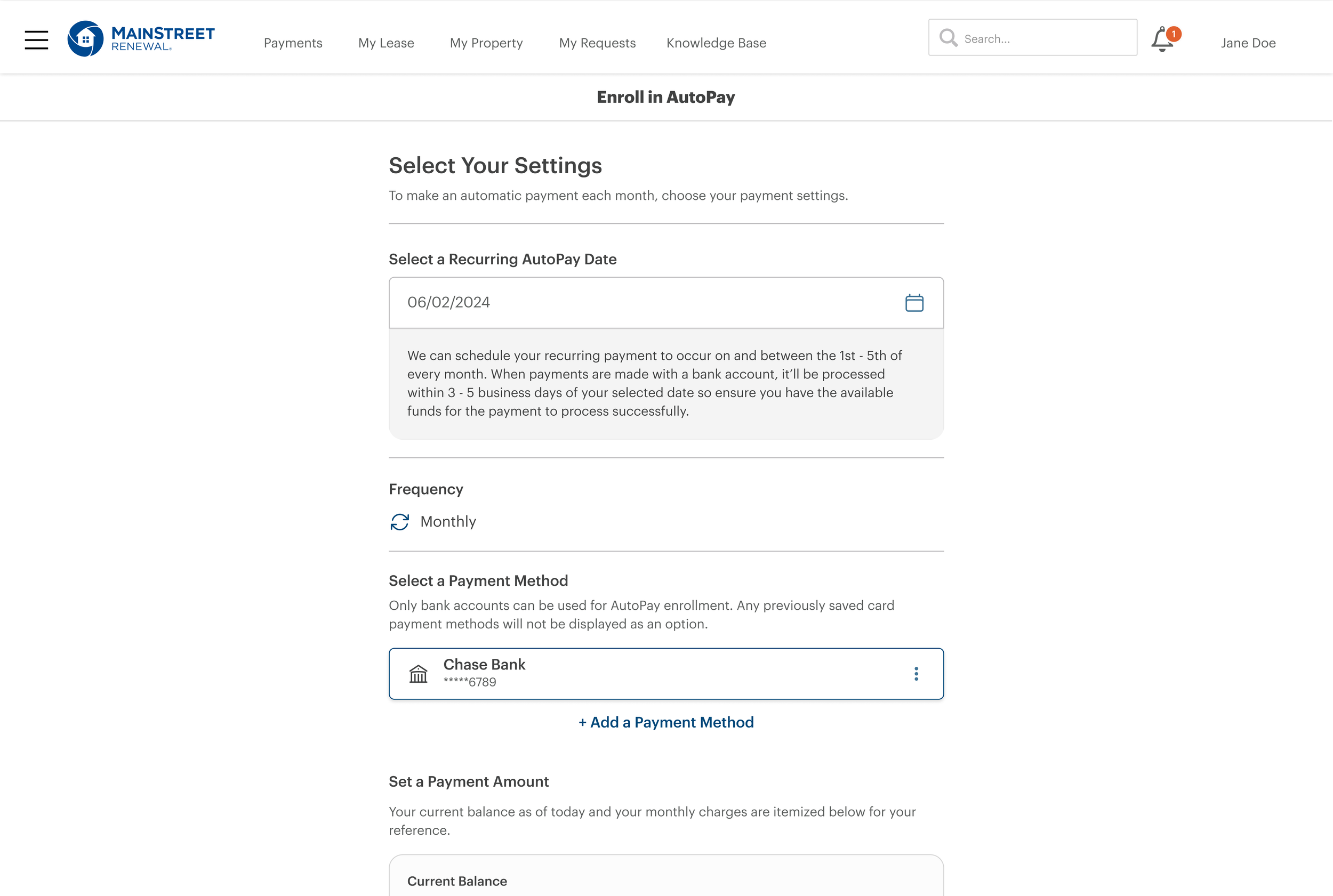
Autopay
Reusable payment patterns created a foundation for recurring rent payments.
Building a system, not just screens.
Moving away from Yardi gave us more control over the experience—but also meant creating a foundation that could scale. We built a shared design system and aligned it with Tailwind CSS, creating reusable patterns across design and development.
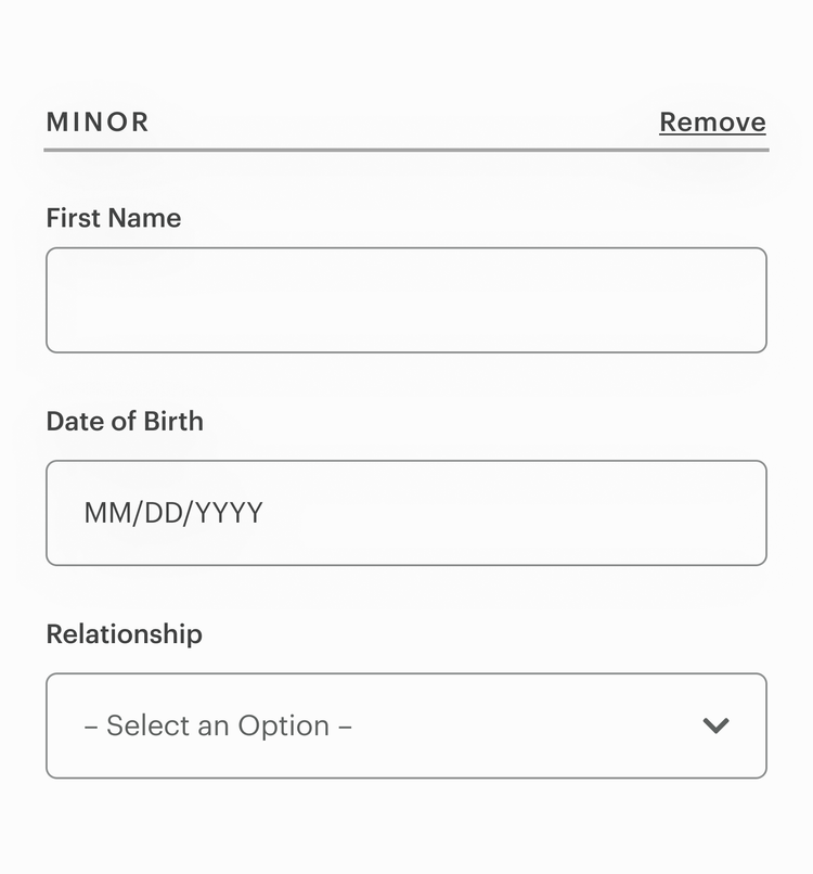
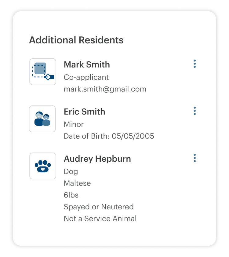
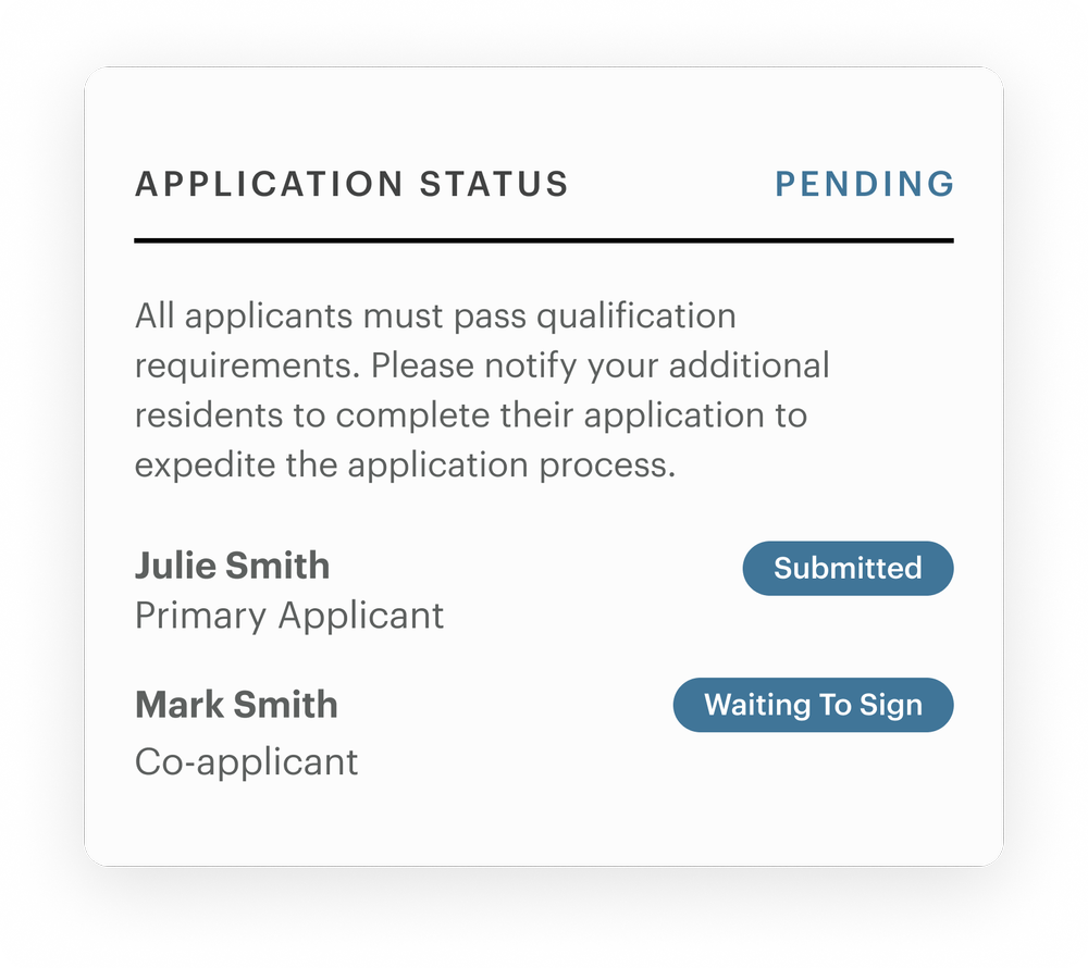
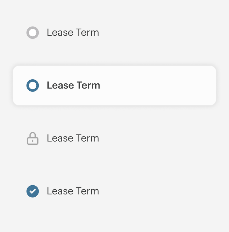
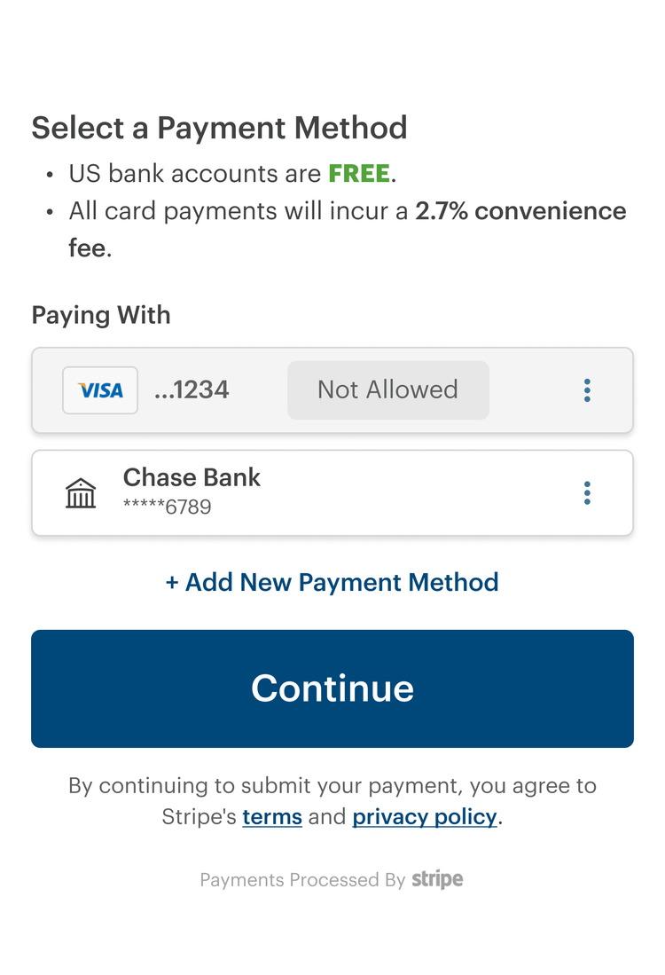
Shared components, interaction patterns, states, and standards created a common foundation for the resident experience.
The design system was aligned with reusable Tailwind patterns, helping design and engineering work from a more consistent implementation foundation.
Less friction for applicants. Less manual work for leasing teams.
The redesigned experience improved conversion, reduced support needs, and shortened the time it took applicants to move through approval.
The redesign solved the immediate problem—but revealed the next one.
Post-launch data showed that primary applicants still struggled when asked to provide information for other household members, especially on mobile.
The next opportunity would be to rethink the household application model entirely—allowing each person to complete their own portion instead of relying on one applicant to collect information for everyone.
A co-application model that gives each household member ownership of their part of the application while keeping the overall status visible to the primary applicant.