

Making rent payments clearer from day one.
Redesigning payments across application fees, rent, and autopay while creating a system that could scale across the resident experience.
The Challenge
Paying rent had too many unanswered questions.
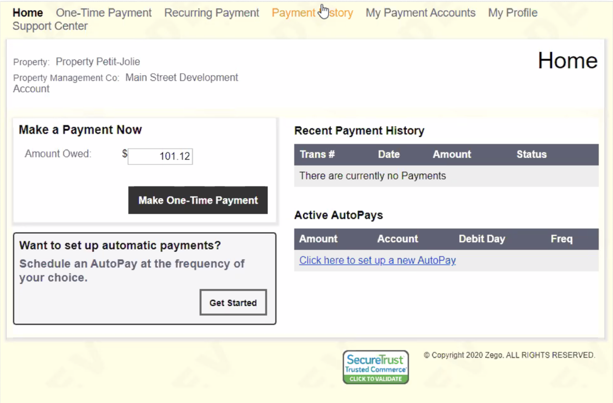
The existing experience gave residents little guidance when making a payment. They had to understand how much they owed, which payment method to use, whether fees applied, and what happened after they clicked submit.
How much do I owe?
Keep the amount and payment details easy to find.
Bank or card?
Help residents understand the difference before choosing.
Are there fees?
Show costs before users enter payment information.
Did it work?
Give clear confirmation or a useful next step when something goes wrong.
Before
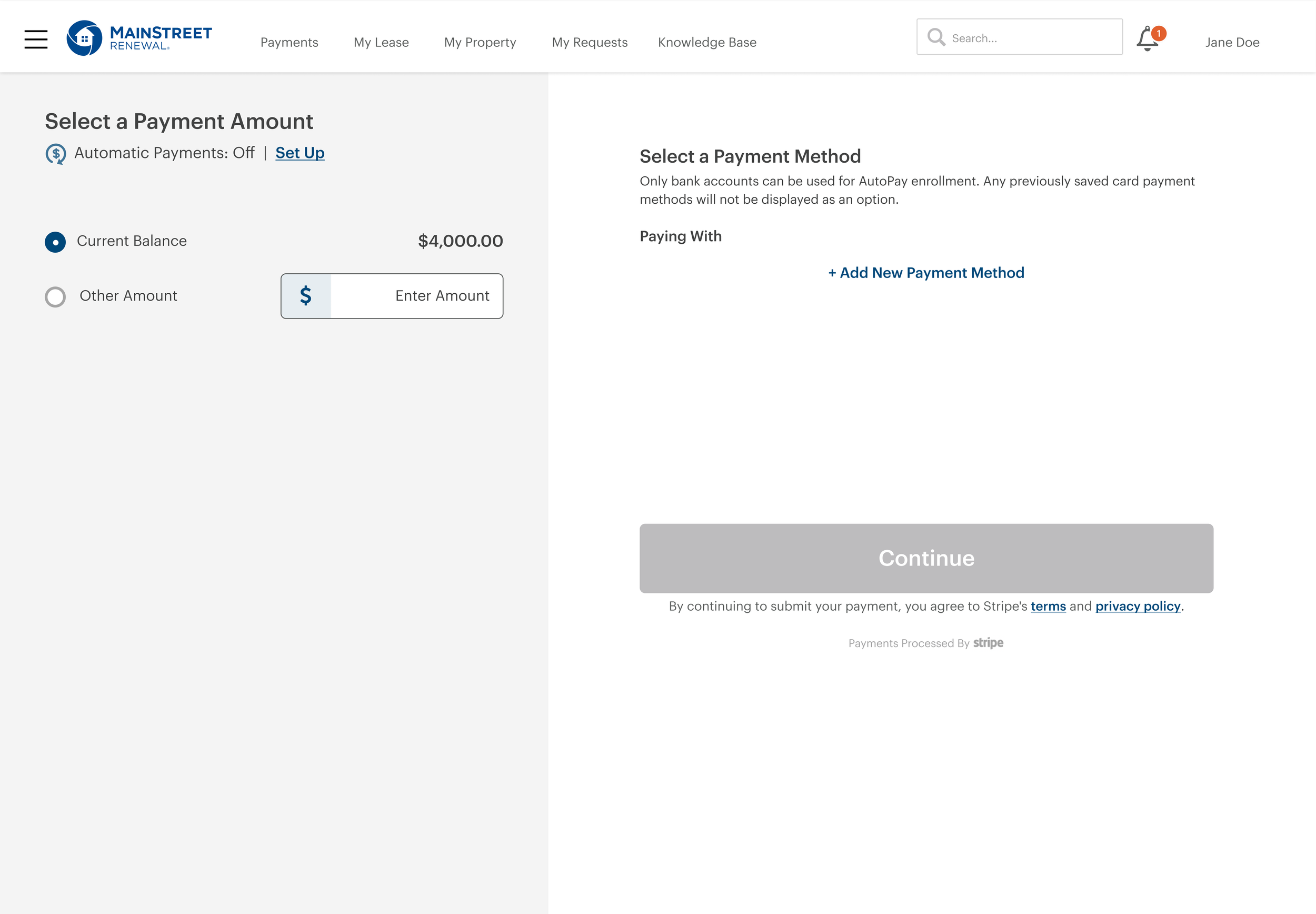
After
Choosing How to Pay
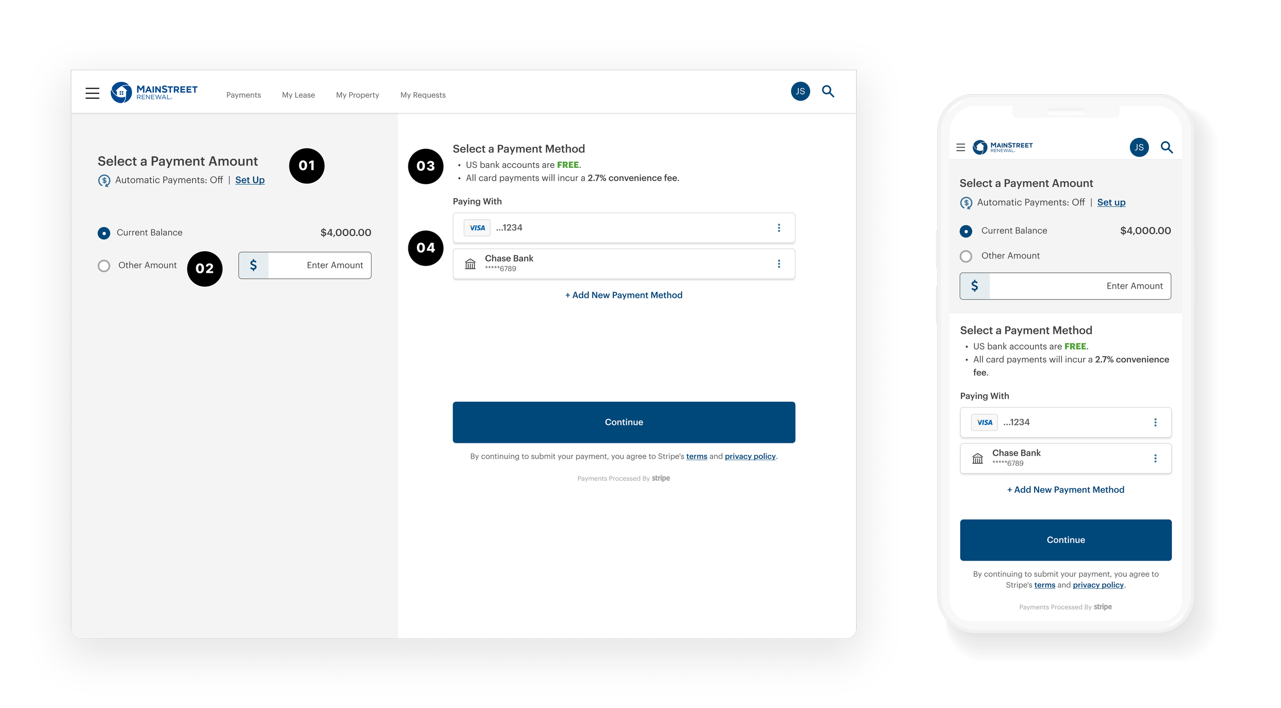
Making the difference between bank and card clear.
Bank payments and cards had different costs, but the existing experience didn't make those differences easy to understand.
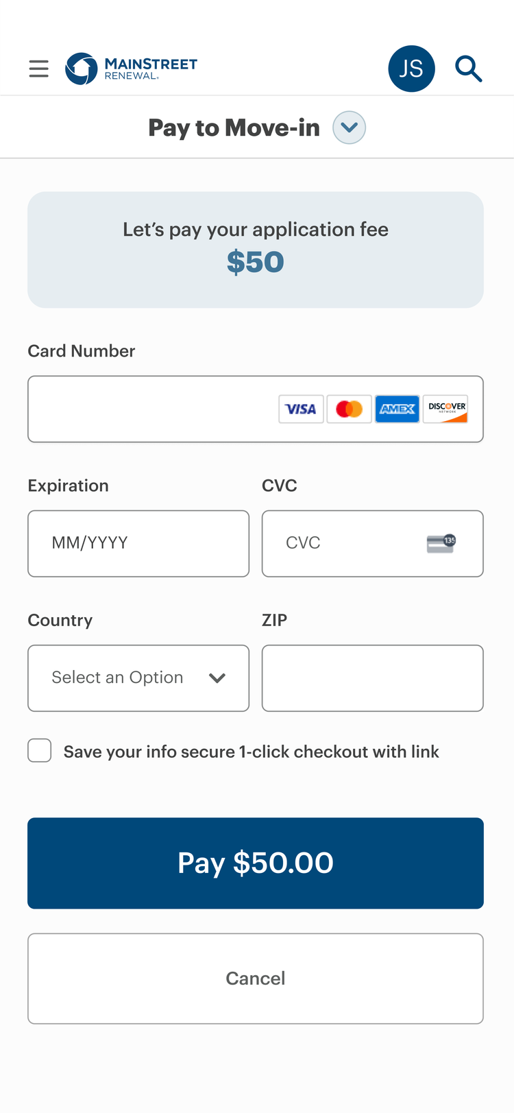
We showed the important information upfront—including fees—so residents could make an informed choice before entering payment details.
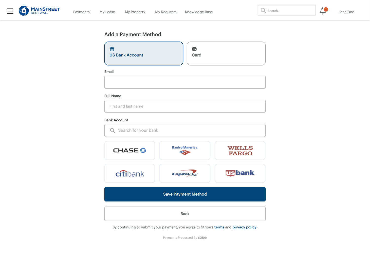
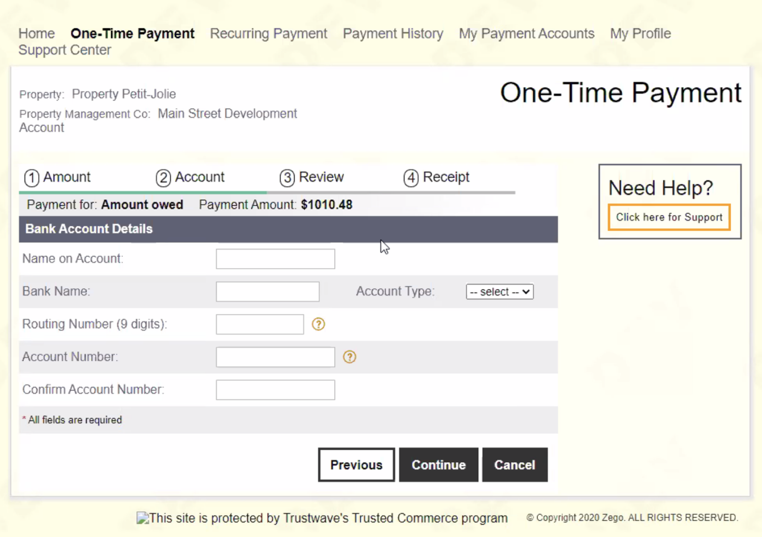
Drag the slider to compare the original bank payment experience with the redesigned flow.
Simplifying the Form
Only show what residents need.
We kept the form familiar and added guidance only where people might hesitate. The payment amount stayed visible, fields followed familiar patterns, and unfamiliar information—such as billing ZIP—was explained when needed.
Confirmation & Errors
Make the next step clear—even when something goes wrong.
After submitting, residents needed immediate confirmation that the payment worked. When it didn't, error messages explained what happened and what they could do next instead of leaving them with a generic error.
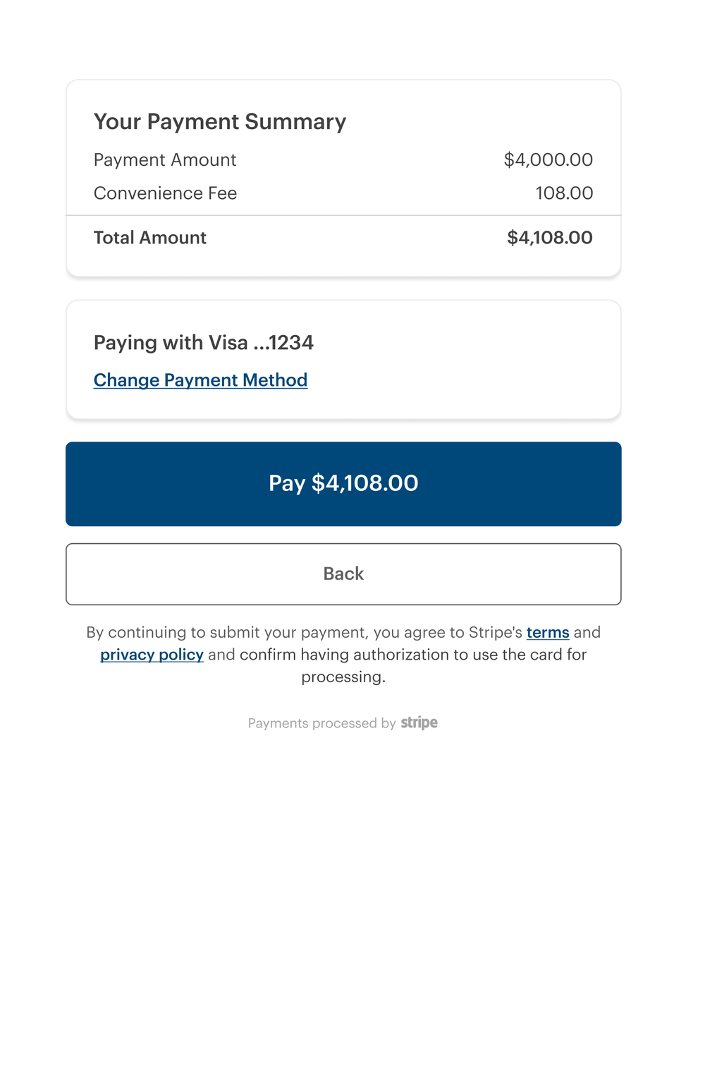
Clear amount, method, date, and confirmation details.
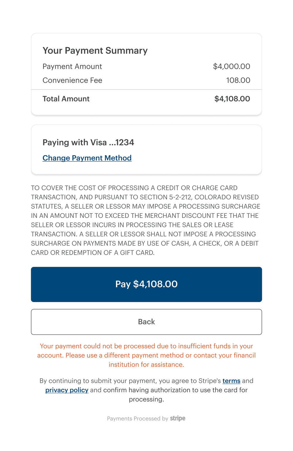
Explain the problem and give users a clear next action.
Autopay
Making recurring rent easier to manage.
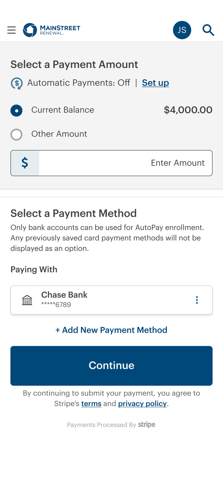
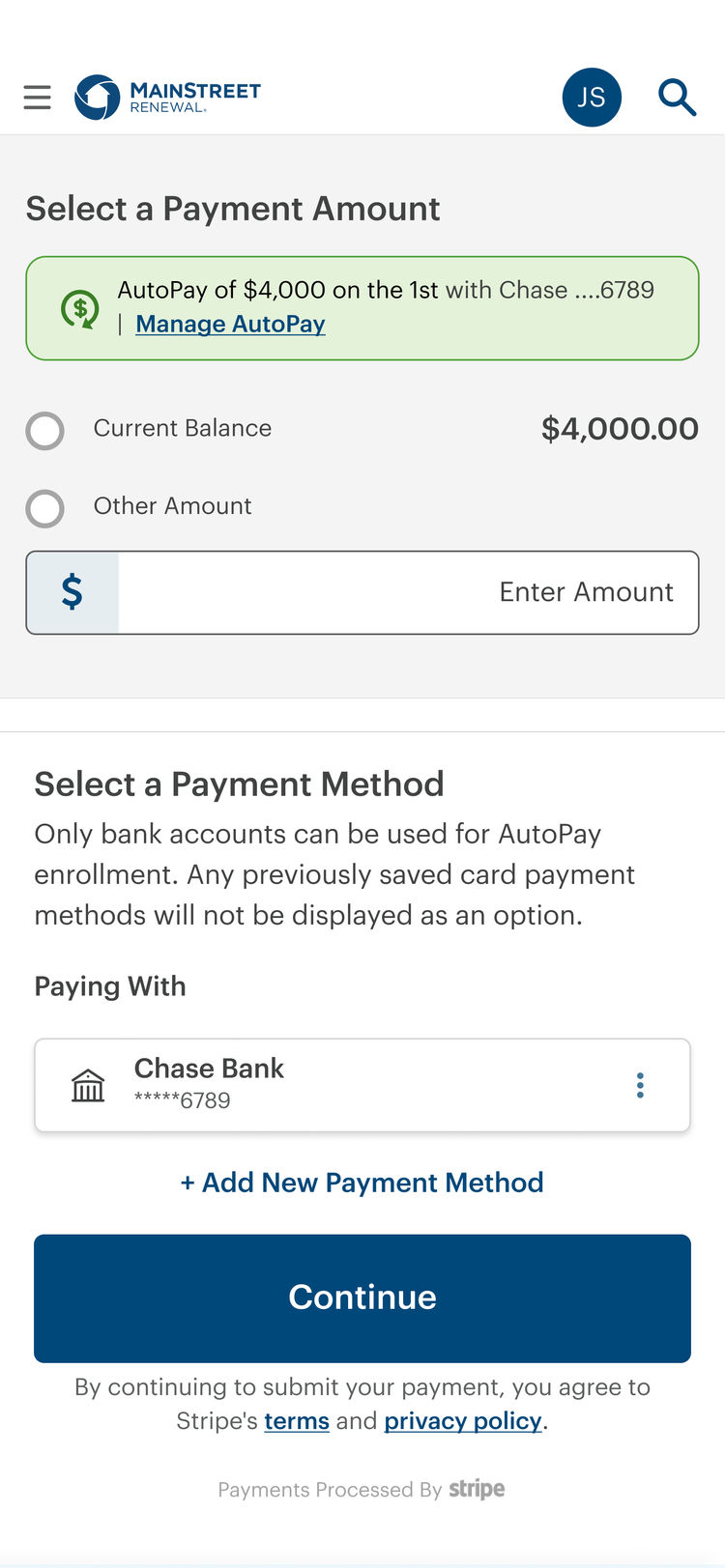
Residents could see what would be paid, when the payment would happen, and which payment method would be used before enrolling. Once enrolled, they could easily see their autopay status and cancel when needed.
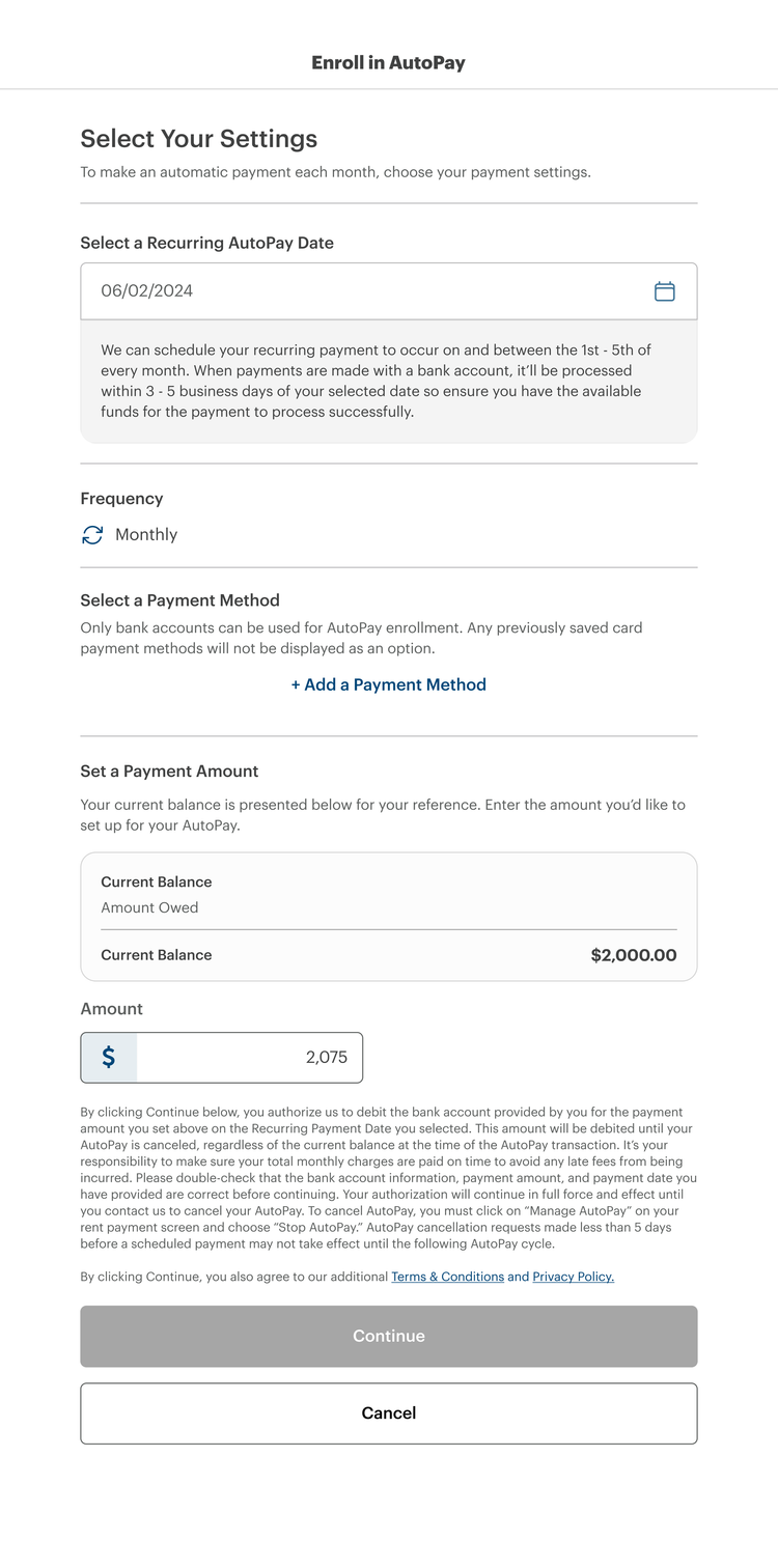
Enroll
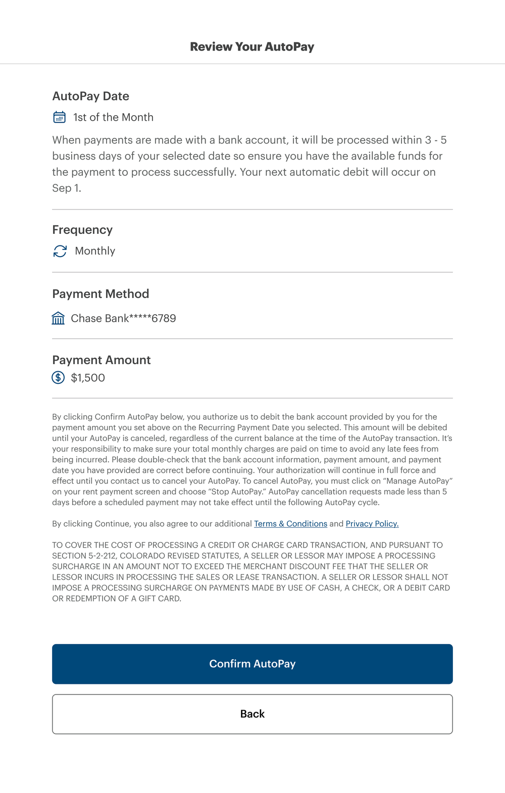
Review details
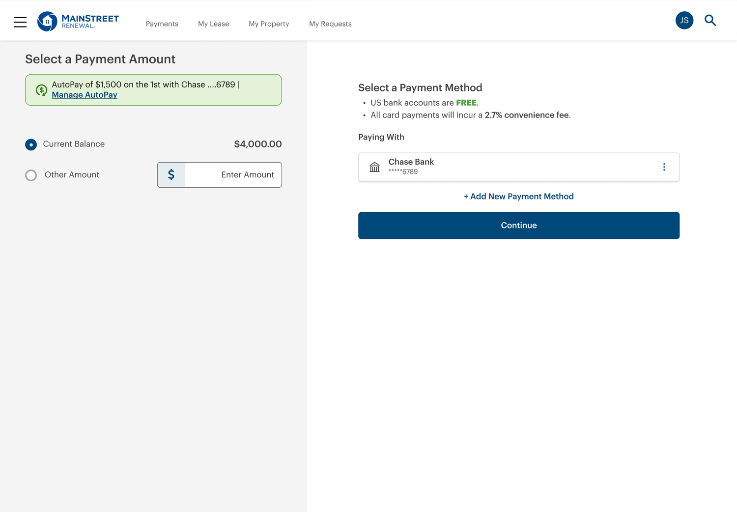
Manage or cancel
One Experience Across Products
Designed to work beyond a single payment screen.
The same payment patterns could be reused across application fees, rent payments, autopay, and renewals—giving residents a more consistent experience and teams a shared starting point.
Application fee
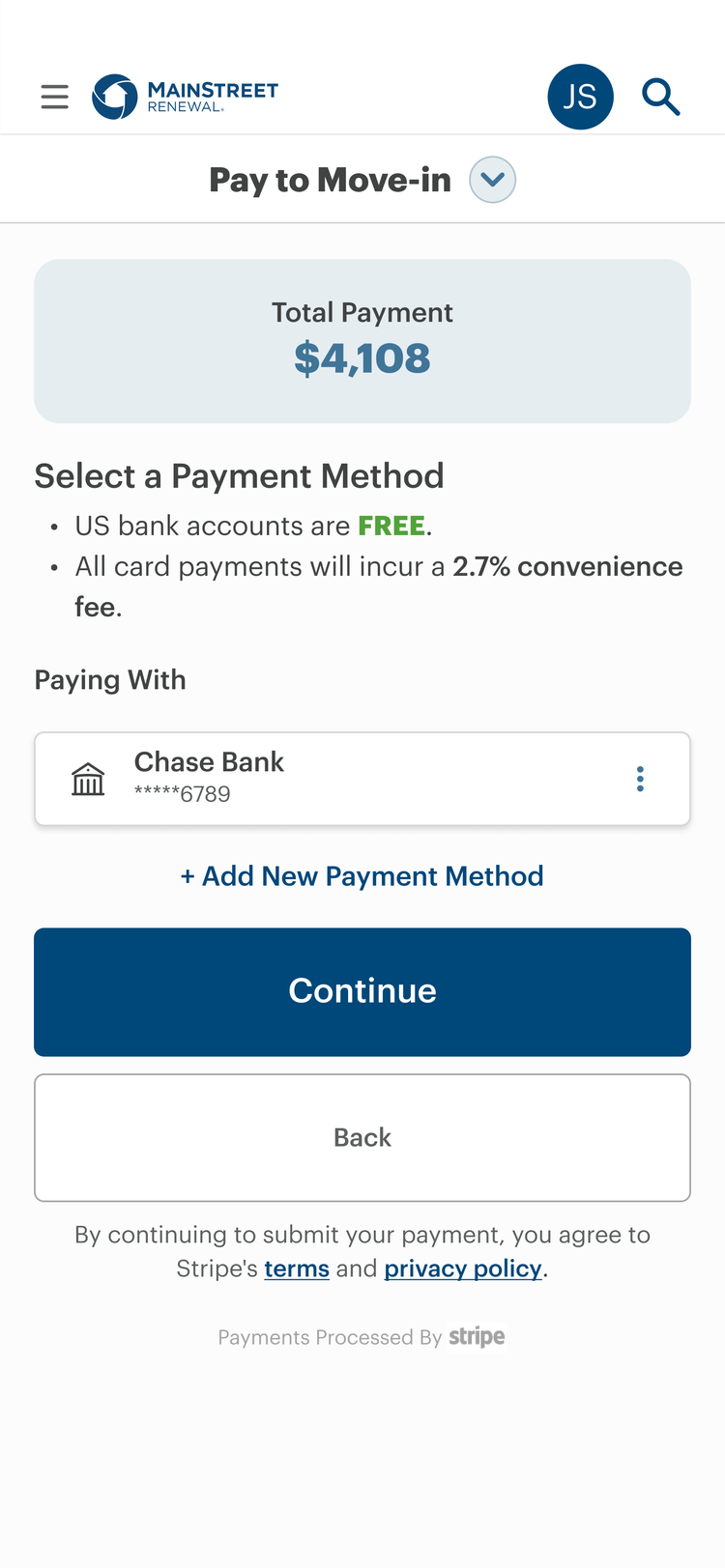
Move-in fee
Rent payment
Autopay
Payment method · Amount · Confirmation · Errors · Security
Impact
Clearer choices changed payment behavior.
ACH adoption
NSF rate
Reflection
Payment UX is about confidence.
Small details matter when money is involved. Showing fees too late creates frustration. Unclear errors create anxiety. Weak confirmation leaves people wondering whether their payment went through.
The redesign focused on giving residents the right information at the right time, so paying rent felt straightforward instead of stressful.